
2021-2022 Exhibitions
Fall Semester, 2021
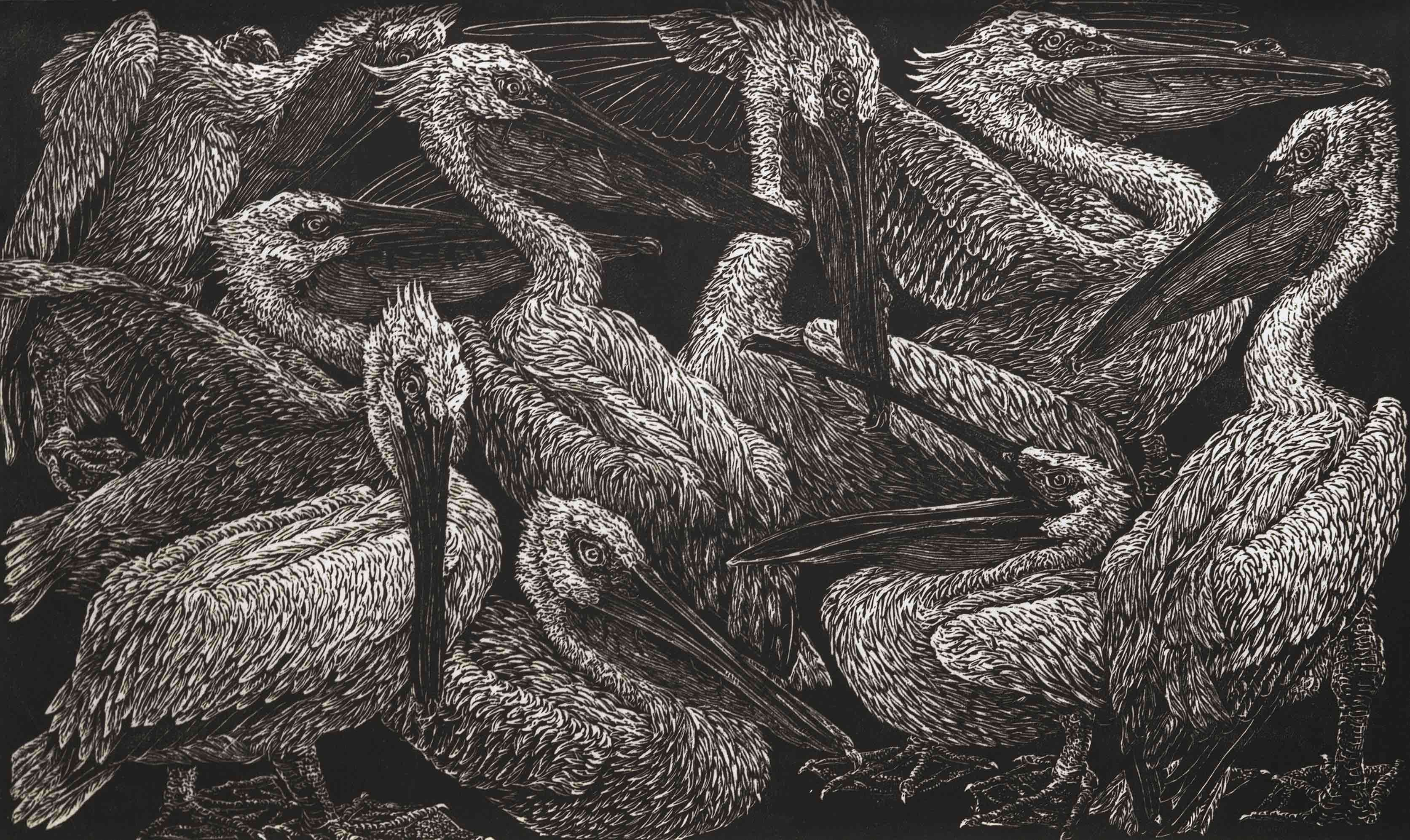
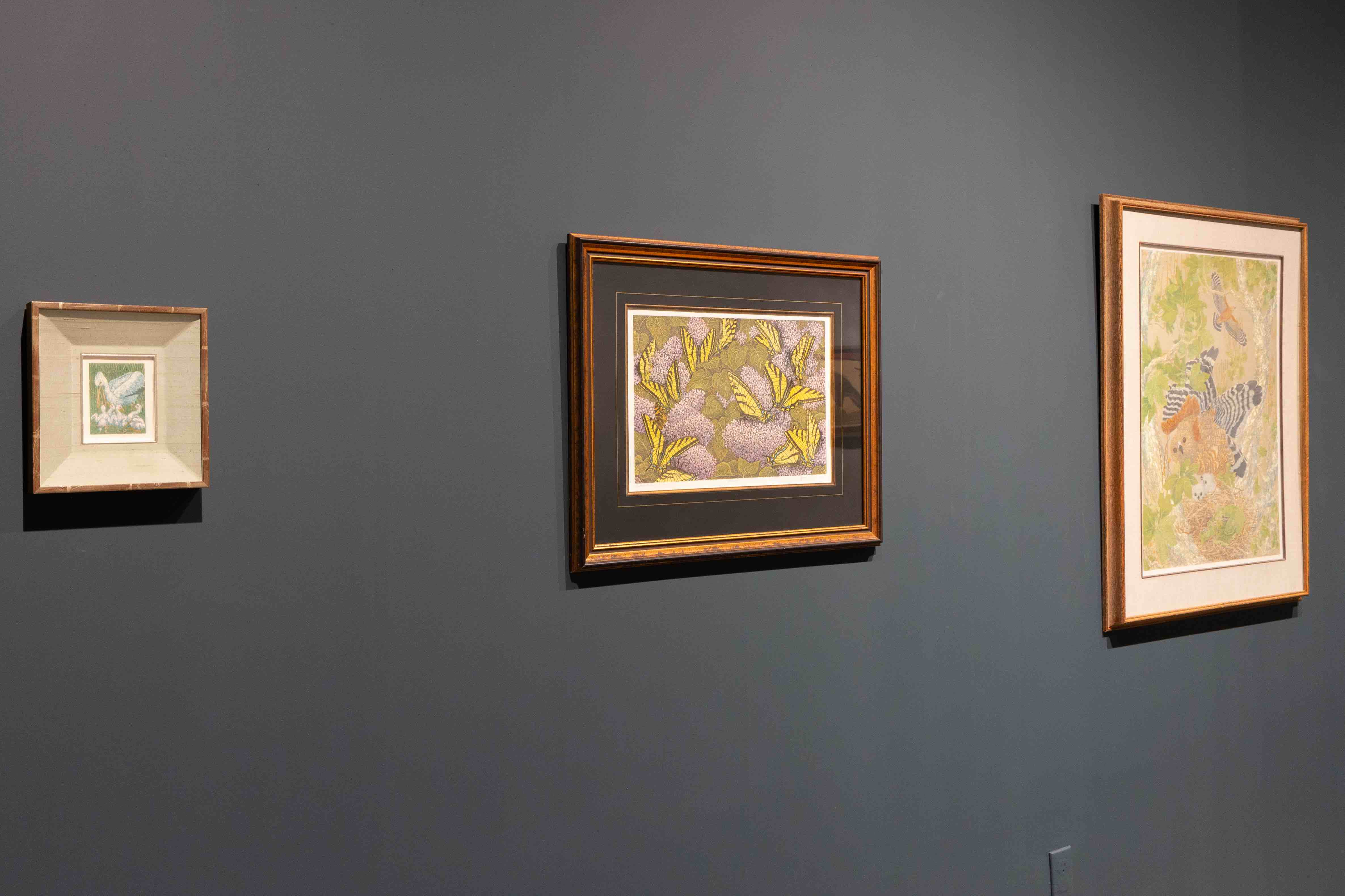
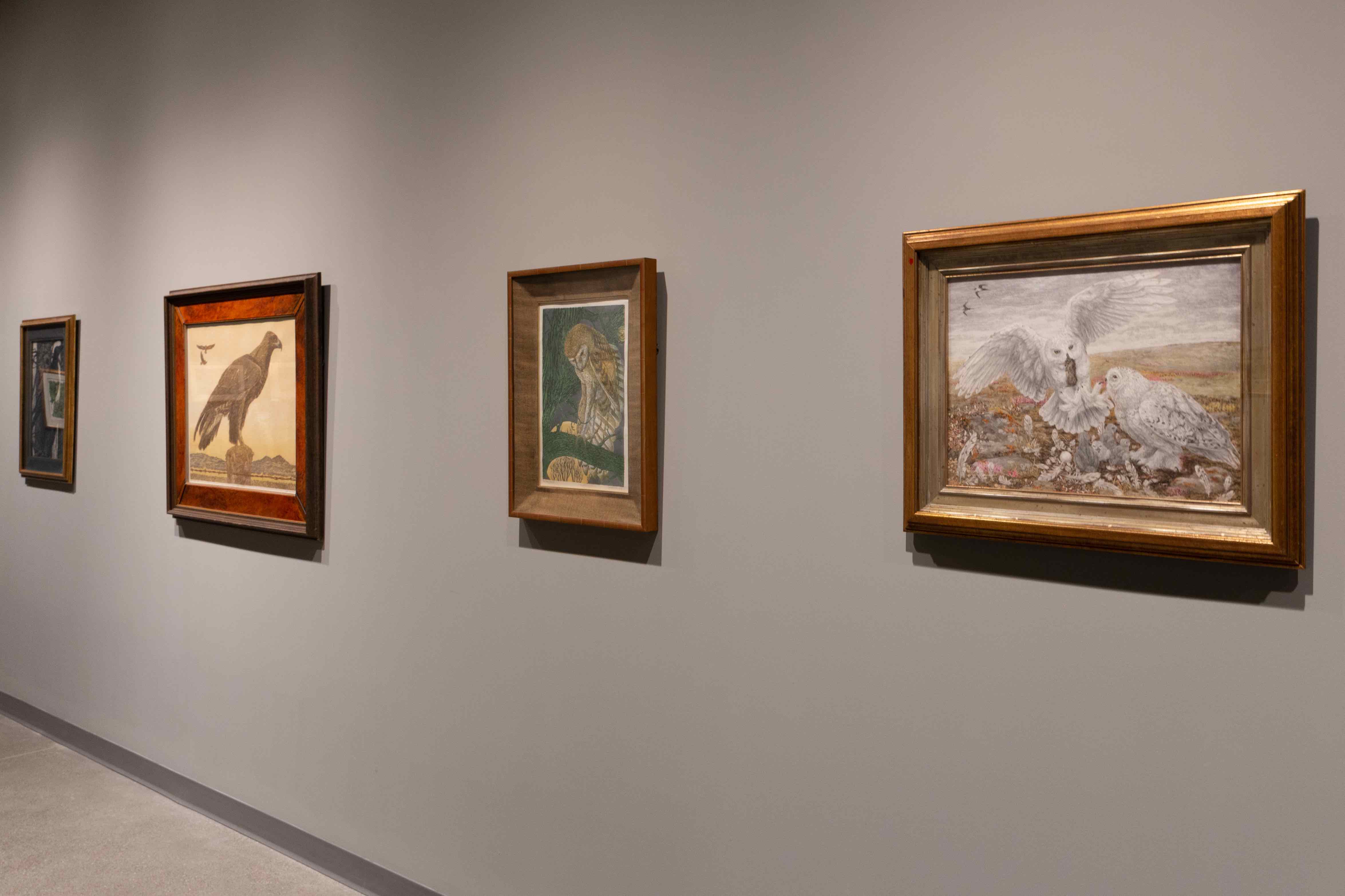
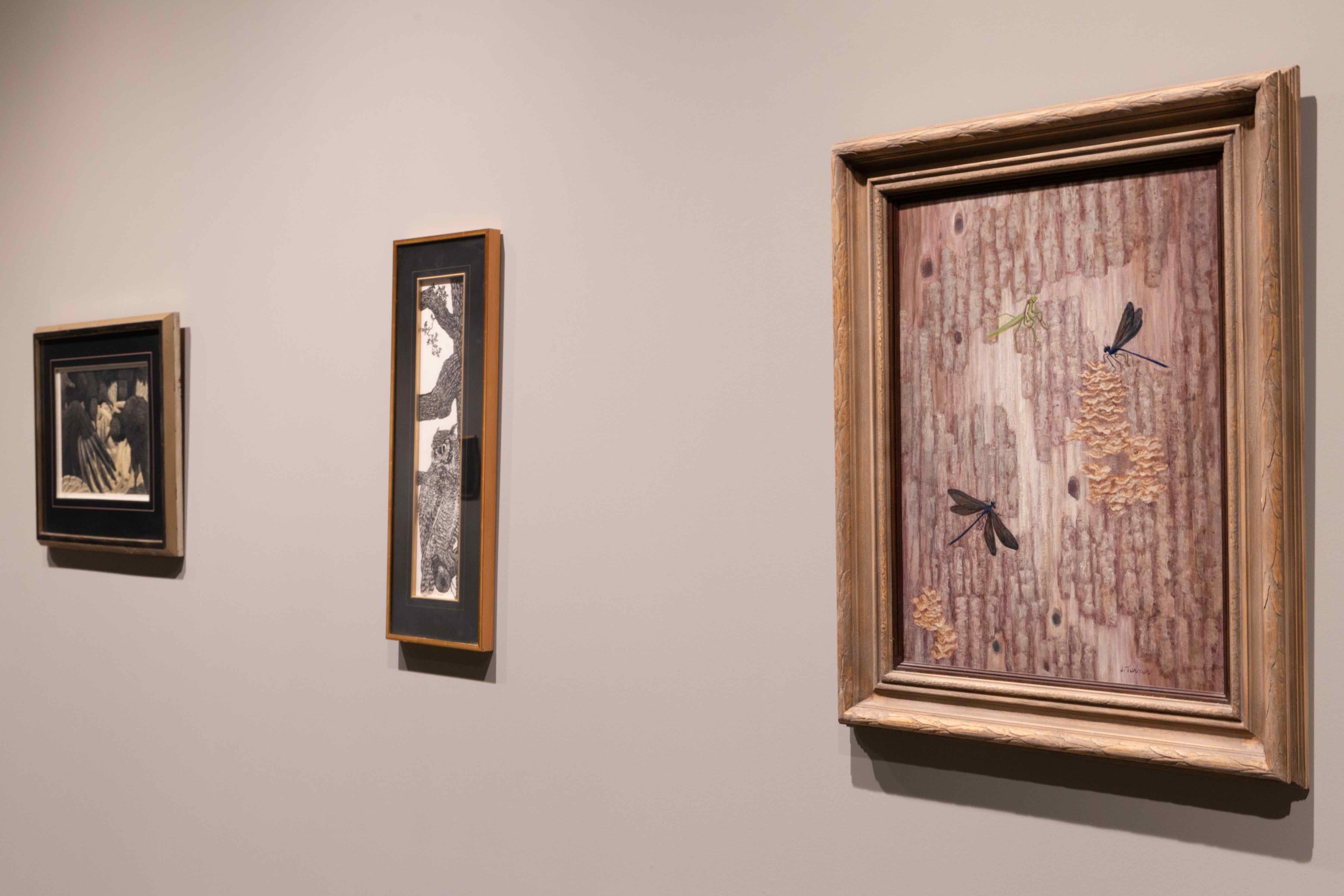
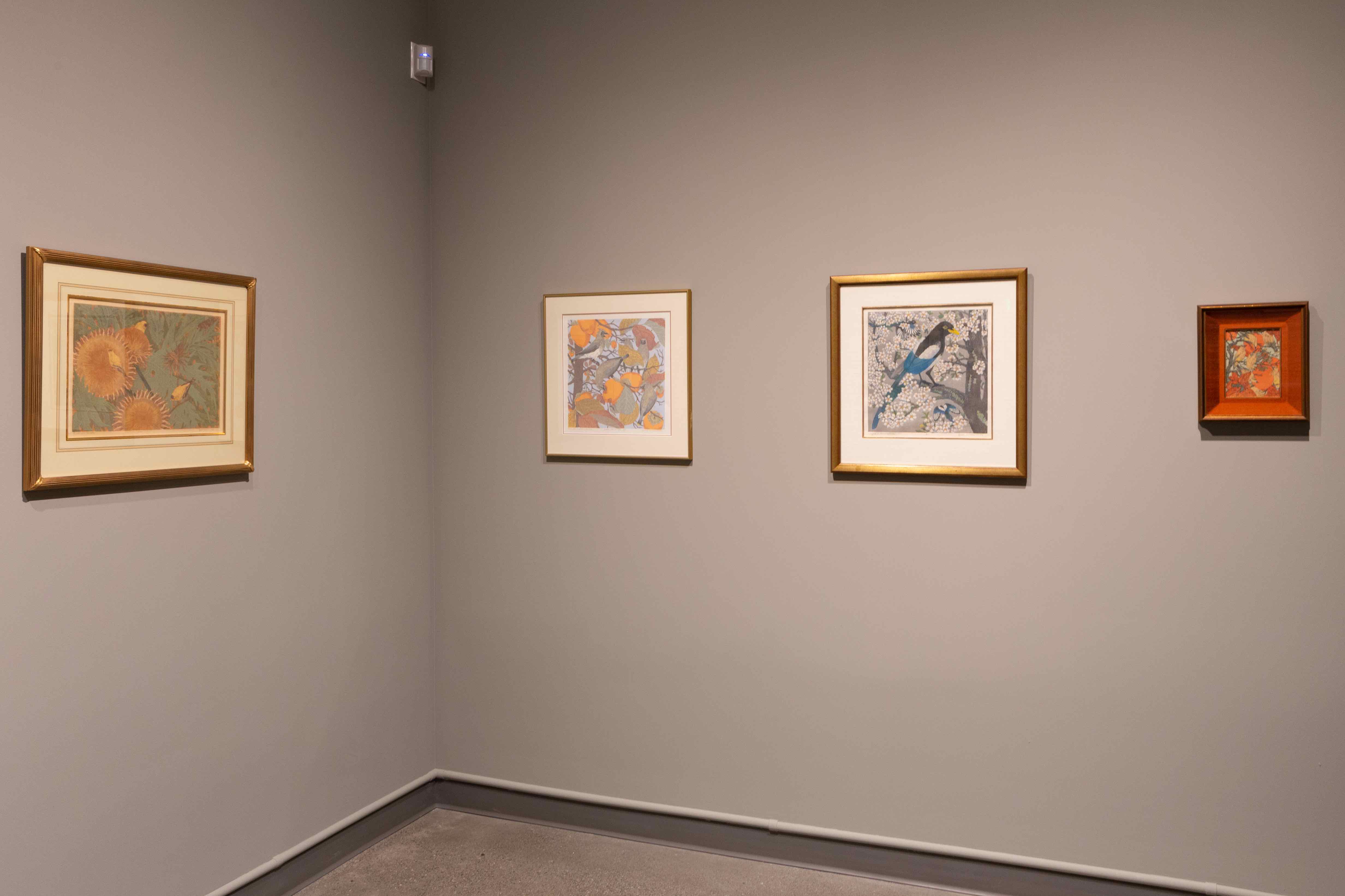
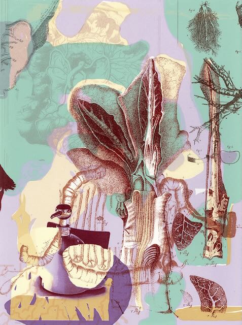
Janet Turner: Unwavering Naturalist
August-September, 2021
After 15 months of closure due to the pandemic, we are excited to welcome guests back to the gallery in June and August for the exhibition "Janet Turner: Unwavering Naturalist." This exhibition features prints and process materials by Janet Turner that focus on the natural world.

- About the exhibition
Janet Elizabeth Turner (1914-1988)
Born in Kansas City, Missouri, Turner was raised on a six-acre farm. She spent multiple summers at a nature camp in Cape Cod, which contributed to her love of biology and art. She studied botany at Stanford University while also taking art classes, and ultimately graduated with a degree in “Far Eastern History” (BA, 1936). Soon after graduation she embarked on a trip to Asia, traveling to Japan, China, the Philippines, Manchuria and Korea on a Phi Delta Kappa tour.
Turner’s biography is punctuated by her many acts of persistence and tenacity. She enrolled in the Kansas City Art Institute, studying under John DeMartelly and Thomas Hart Benton, important figures in the Regionalist Movement. After graduating, Turner was hired as a teacher at the Girls’ Collegiate School in Claremont and while working also earned her MFA in 1947 from Scripps, where she studied under Millard Sheets. After receiving her MFA she was hired as an assistant professor at Stephen F. Austin State College in Nacogdoches, Texas. During her time at Stephen F. Austin, Turner established an impressive national profile, earning awards and honors and participating in many prestigious exhibitions. Frustrated by the lack of appreciation for her work by her male colleagues, Turner sought new opportunities to achieve her goals. She was awarded a Guggenheim Fellowship and loved her time in New York, enrolling in Columbia and earning her doctorate in education in 1960 from Columbia. Near the end of her degree she was offered a job at CSU, Chico (1959), where she taught until her retirement in 1981.
Janet Turner was selected as the first Chico State professor to be awarded the California State University’s Outstanding Professor Award (1975) and finished her career with many accolades and honors. The Annex Gallery notes that “Turner was an avid collector of fine prints, beginning with a women printmakers’ print club in which she traded and critiqued works alongside her contemporaries. She expanded her collection to include works she found along her travels, and she did not discriminate between popular and obscure artists.” With generosity and vision she donated her large collection of prints by artists from around the world to CSU, Chico, which form the foundation of the Turner Collection (now including over 4000 prints).
Janet Turner exhibited her work prolifically throughout her long career, and her prints and paintings have been exhibited in every state, in 50 countries, and on six continents. They have been shown in over 200 solo exhibitions including in multiple cities in Japan and Israel. Turner was elected an “Active Member of Audubon Artists in the Graphic Arts Section,” and was lauded by Patye Billfaldt, art editor for the Houston Post for having “meticulous technique,” “but for all of this the results are not photographic. It is a realism that is selective rather than representative and academic in a studied sense.” She was also an elected Member of the National Academy of Design in New York City, the National Association of Women Artists, and served as President of the National Serigraph Society.
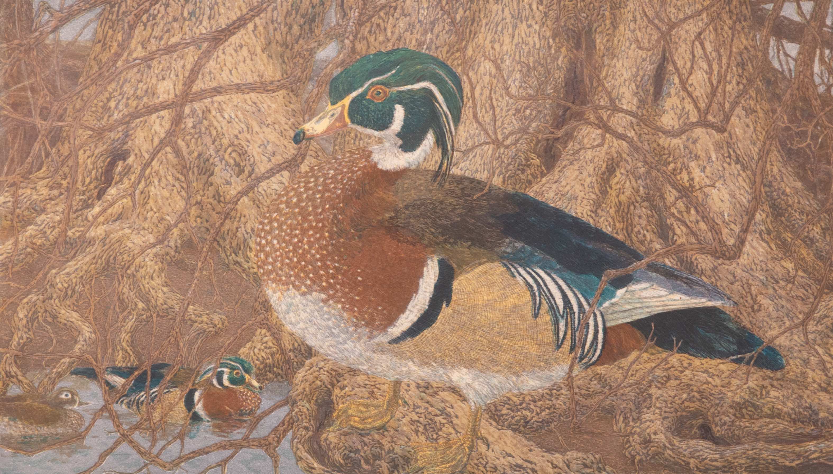
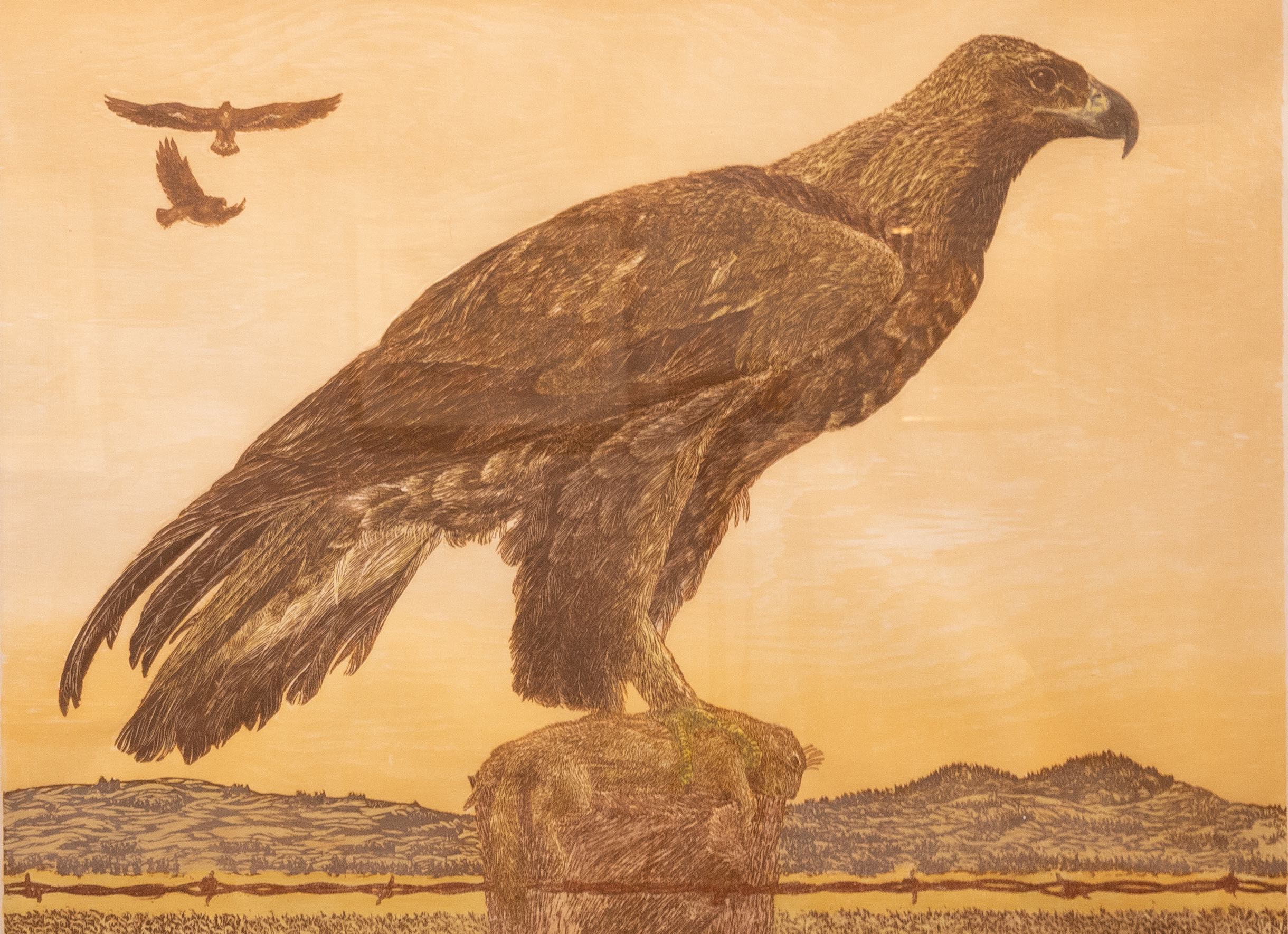
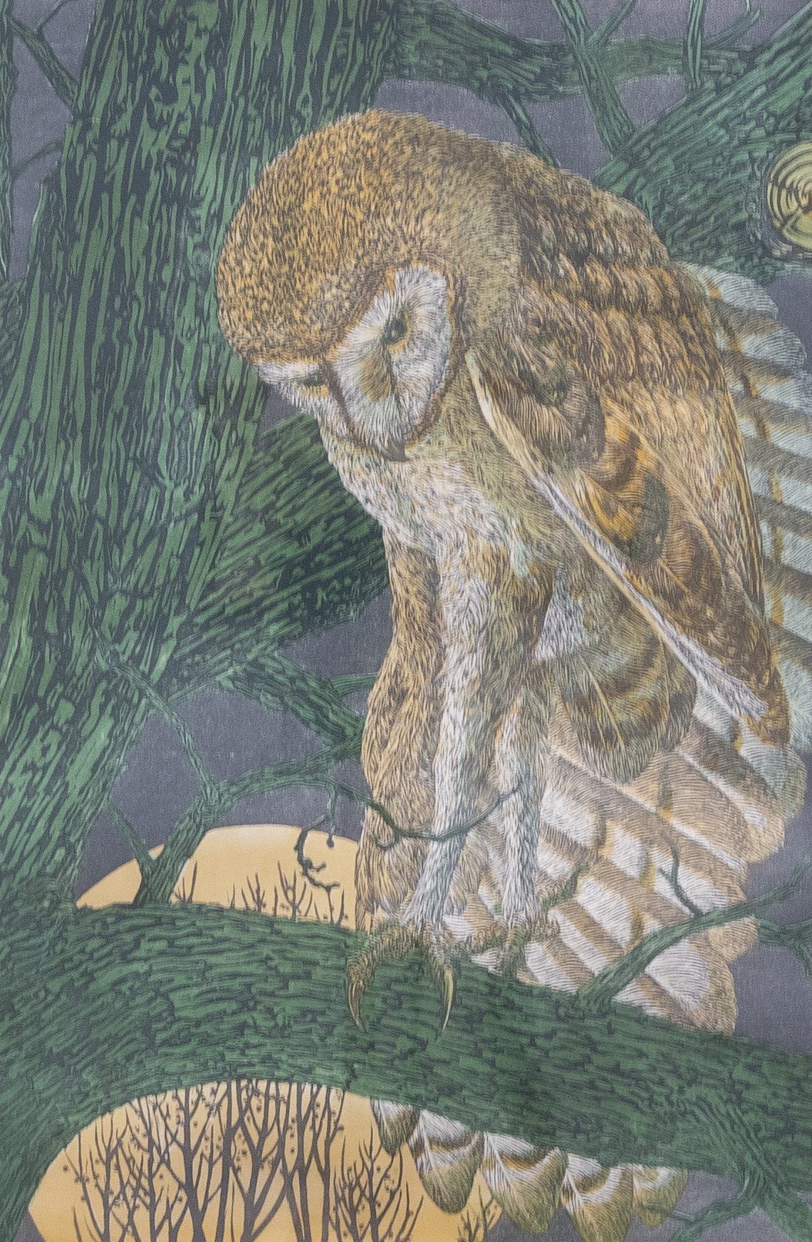
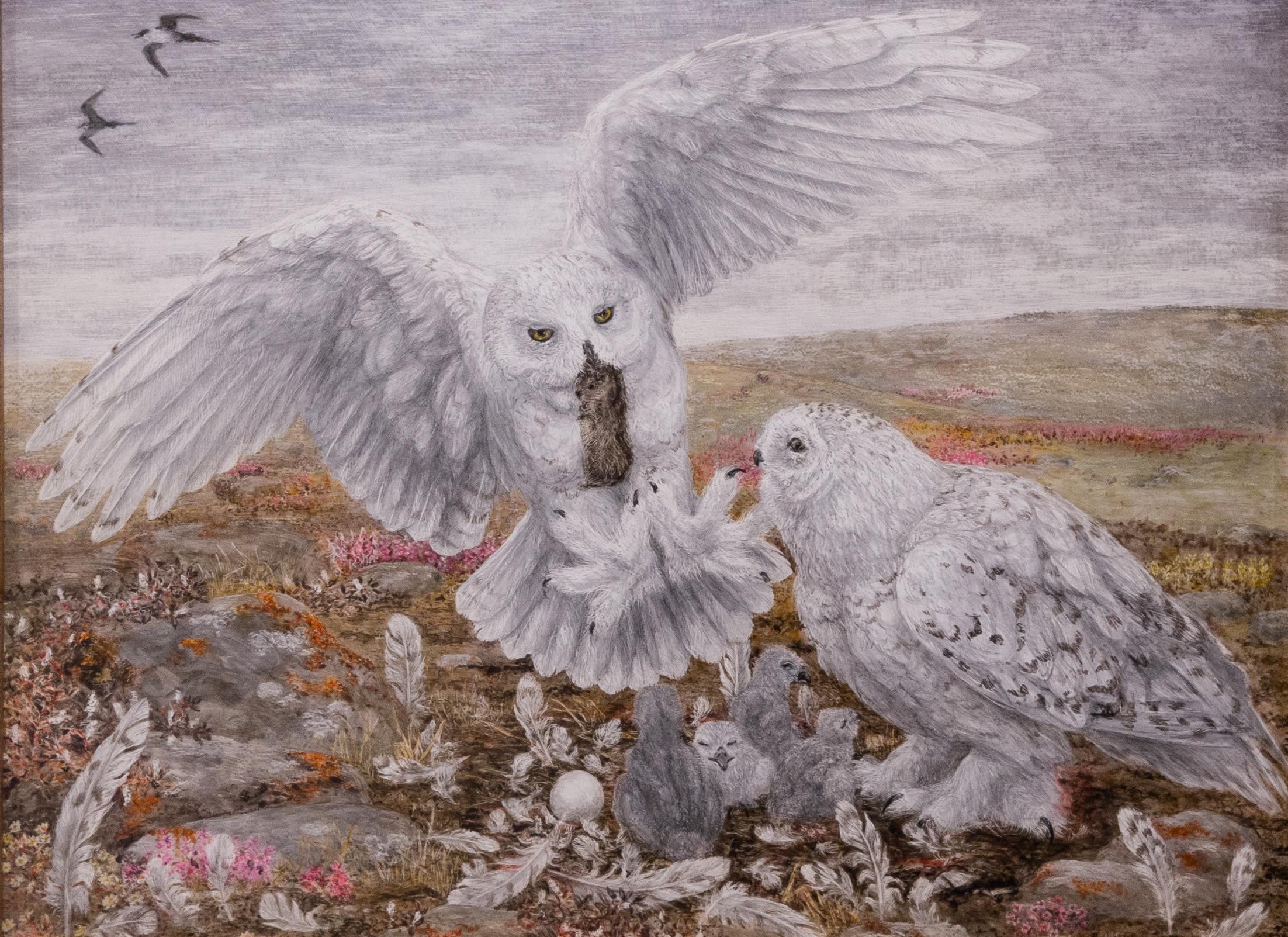
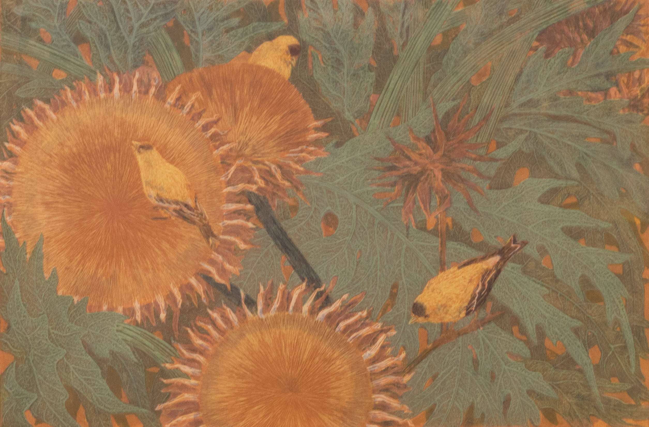
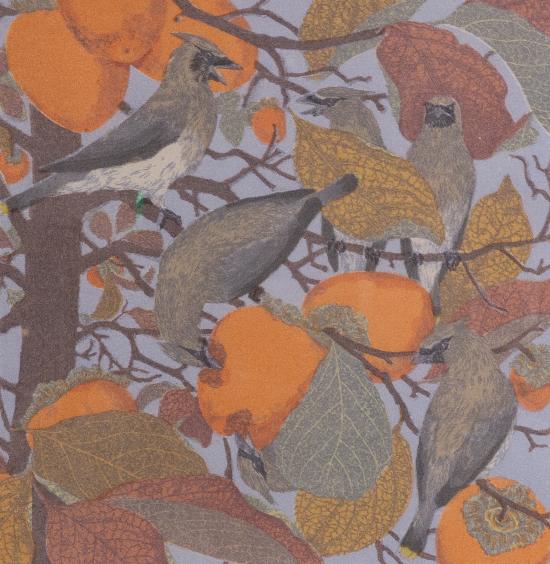
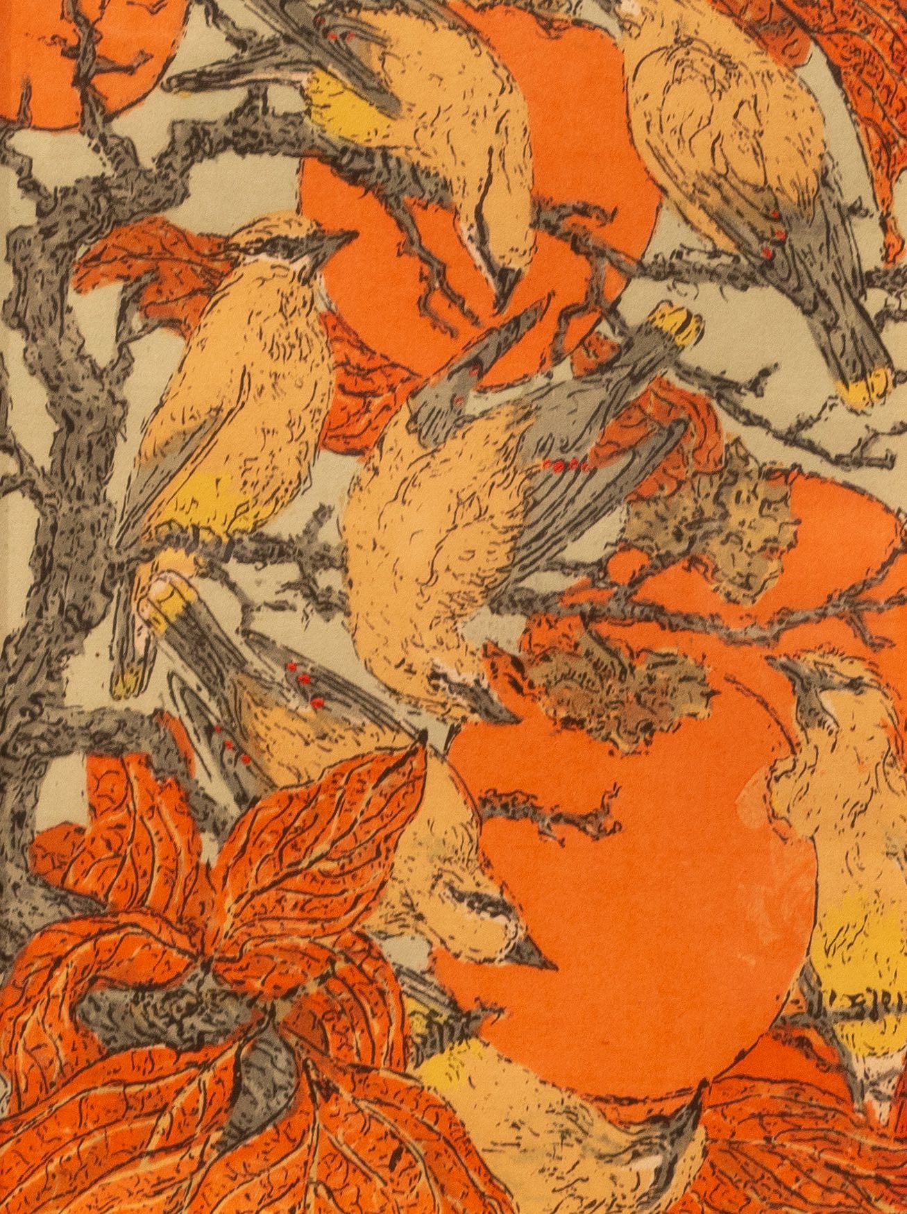
Some of the works included in this exhibition were created during her time in Nacogdoches, and others are from her Chico years. As David Farmer notes “while the quiet town of Nacogdoches was rich in history and surrounded by East Texas woods and wildlife, it seemed remote for Turner, fresh from her undergraduate years at Stanford, her studies in Kansas City, and enriching experiences teaching and studying art at Claremont. Yet, her next nine years at Nacogdoches were intense and productive. Natural habitats like the Big Thicket were nearby, rich in the wildlife -- especially birds -- she loved to observe.” The Grace Museum in Abilene, Texas, explains that “Turner’s work reflects her work as an environmentalist and close observer of flora and fauna in their natural habitat. Each detailed and carefully created print or painting reveals the beauty of the natural world teaming with life, color and form. The variety of printmaking techniques on view demonstrates Turner’s mastery of serigraphy, linocut, engraving, aquatint, and lithography. The range of color and complexity of each print often entails multiple printmaking processes on a single print.”
The prints in this exhibition reveal what James McManus refers to as Turner’s “position as an ecologist and an astute observer of nature.” Roger Lederer reflects that “in California, she began to concentrate on local bird images. She took hundreds of photographs and often borrowed bird skins from the university’s natural history museum. Birds were the centerpiece of all of her works, and the backgrounds were faithful to the natural habitat. A pheasant, gingerly walking through a dense bed of live and dead reeds, hidden from prying eyes, looks up at a Marsh Wren peering down at him. Her magpie in a tree contrasts with the blossoms behind him. It appears that the tree was the main focus of the print and a magpie somehow got in the middle of it. In addition, two other magpies are surreptitiously flying in the distance, filling up the little space that the blossoms do not” while other works offer “examples of full frame composition – the subjects fill the picture. Although the birds are realistic, their positions and interactions are not… demonstrat[ing] her knowledge of Japanese woodcuts in their flat space.”
In addition to prints, paintings, process materials (scratchboards, silkscreen and zinc plate) the exhibition is greatly enhanced by Janet Turner’s own voice. Featuring clips from several educational videos Turner filmed in the 1970s, including “Why Art? Why Prints?” (1976); “Beginning Printmaking: Printing Technique” (1975); “Beginning Printmaking: Different Qualities of Design” (1975); and “Beginning Steps for Etching” (1978) viewers can get an intimate look into Turner’s process and artistic priorities.
Janet Turner was unwavering in her celebration, concern, and investigation of the natural world, and we are extremely lucky to be able to draw inspiration and energy from her detailed visions.
Laura Nice, June 2021
Figural: Bodies in Print
September-November, 2021
This exhibition, a collaboration between studio art and dance faculty, brings the vitality of movement and life drawing into conversation with diverse figurative works from the Turner print collection. This exhibition is generously sponsored by Joe and Judy Chiapella.
- Events
Gallery Talk for Alumni and Family Weekend
Laura Nice, Director of Special Projects
Friday, October 8 | 11:00 AM
Turner Gallery
Dance Performance Panel Discussion of "Then and Back"
Megan Zollinger (Dance Faculty and Choreographer), Jeff Oliver (Poet and Performer), Matsumi Kawamura (Dancer), and Elizabeth Grace Davis (Costume Designer). Performance inspired by Oliver's poem "The Astronomer's Daughter" and the print "Sleepless Night II" by Matilde Charlotte Rosenthal Ziegler included in Figural: Bodies in Print.
Tuesday, October 19 | 5:30 PM
Gallery Talk with Guest Curators
J Pouwels (Painting & Drawing), Trevor Lalaguna (Sculpture), and Megan Zollinger (Dance)
Tuesday, October 26 | 5:30 PM
Turner Gallery
Live figure drawing: Intermediate and Advanced Life Drawing students
J. Pouwels (Art Faculty, Painting & Drawing)
November | Days and Times TBD
MFA Gallery Performance by students from Intermediate Sculpture
Trevor Lalaguna (Art Faculty, Sculpture)
Thursday, November 18 | Time and location TBA
- Exhibition Statement
The Turner is proud to return to on-campus programming by building upon a long tradition of faculty-led exhibitions. This exhibition draws upon the expertise of Art and Dance faculty to explore printed representations of the body and movement. The prints included in this exhibition were selected by three Guest Curators: Art studio faculty Trevor Lalaguna (MFA) and J. Pouwels (MFA), and by Dance faculty Megan Glynn Zollinger (MFA).
The human body has been a wildly popular, inspirational, and highly valued subject for artists and their audiences from the ancient world until today. Figurative art encompasses many definitions: on the one hand, the subject of figurative art is the noun “figure,” usually the body; but the artist also “figures” or creates representations of the figure. Therefore, figurative art is figural, rather than literal, and this is the meaning that has captured the imagination of centuries of artists who have created art in the taut space between abstraction and realism. Printmakers, in particular, have used the versatility, variability, and totality of their methods to capture the depths of human emotions and the body.
Ellen Heck, a printmaker, combined the methods of drypoint, woodcut, and variable editioning in her Forty Fridas portfolio (2012). In reflecting upon the process, Heck explains that “so much emotive character depends upon the placement of a line, the angle of an eyebrow, the darkness of a mark at the corner of a mouth.” This is true, of course, for all figurative artists, but printmakers have additional tools at their disposal that can further manipulate these lines and values to capture striking, raw, human emotion. For example, in Käthe Kollwitz’s Sharpening the Scythe (1905, restrike 1921), on display in the current exhibition, the artist utilized line etching, drypoint, sandpaper, aquatint and soft ground to create an intense range of values with very few lines that captures the subject’s strength, resilience, and determination. In other examples in the current exhibition, such as Linda Lee Boyd’s detailed woodcut Stucco Workers (2005) or Guillermo Silva Sanz de Santamaria’s whimsical lithograph Telefonos Publicos (1977), artists use exquisite lines to render human (and human-like) bodies in action. Taken together, the works in this exhibition reveal the psychological and physiological diversity of the human form, as expressed by the unique tools and processes of the printmaker.
This exhibition is intended not only as a celebration of figurative works from the Turner Collection, but as a living space of inspiration, invention, and reinvention. In October we will unveil a recorded dance performance, choreographed by Megan Zollinger, and inspired by poetry and Matilde Charlotte Rosenthal Ziegler’ etching Sleepless Night II. In November the MFA Gallery will be filled with process work by J. Pouwel’s Life Drawing students, and we will also be invited to enjoy performances by students in Trevor Lalaguna’s Intermediate Sculpture class, inspired by prints in Figural: Bodies in Print.
Huge thanks to Megan, Trevor and J for your collaborative approach; Adria Davis, Collection Manager for guiding the selection process and installation of the exhibition; and to the fabulous team of interns and gallery assistants for help installing – Hugo Mendoza, Aimee Allenegui, Christian Navarrete, Brandon Hernandez and Rae Helms. Thanks also to David Barta for huge assistance in building a frame for the projection dance piece.
Finally, this exhibition is Generously Sponsored by Joe and Judy Chiapella. Thank you to Joe and Judy for your meaningful support of the Turner and the arts in Chico for making vibrant art programming possible.
Laura Nice, Director of Special Projects
- Curator Statements
Trevor Lalaguna, Guest Curator, Art Faculty, Sculpture
For the current exhibition, I approached the selection process looking for figurative work that could potentially spark a response from the current group of California State University, Chico sculpture students. Work that could inspire an action or performance art piece. The pieces chosen for the show are not directly narrative, but have open elements that could help build a broader creative interpretation.
As a figurative artist and instructor, I personally pull inspiration by witnessing others in day-to-day activities. I’m always drawn towards situations that stand out. For instance, recently I saw a woman stumble on a cracked portion of the sidewalk, she then turned and stared at it with such anger as if it were her ultimate enemy. From a situation like this, I could imagine myself performing as the lifted piece of concrete, apologizing to this woman. My sculptural style often leans towards fabricating personified objects and planting them in everyday human interactions. For my own work, and for this exhibition, the figure is a potent messenger to carry ideas from artist to viewer.
J Pouwels, Guest Curator, Art Faculty, Painting and Drawing
Drawing from Life As art practice, observation helps to bring a relatively literal vision of the world into the gallery space, with all its wonder, dynamics, messiness and pimples. As an exercise, drawing from observation keeps the eye and the hand on friendly terms: Recalibrating a connection that often times wants to drift as our attention does. To navigate our complex lives we rely on generalities (interpretation) to be able to keep up with the rapid pace of modernity. We see people, things and spaces as shells of what they really are, a kind of visual short-hand for folks on the go.
Life drawing is an exercise in focus, in looking, in learning how to “see” again. Slowly, carefully, studying something as it exists in space: the model, stillness, an opportunity to examine, to render. It is a luxury to be able to spend time devoted to observing a curve, a turn in the form or a shift in value that exposes higher definition than was at first observed. To be able to linger with shapes and volume and spatial relationships that bring observation to life, and to strike a line over and over until it feels in its very self, a being - breathing. This attention to looking and mark making is the precursor to portraiture, narrative, and non-sequitur art works that all artists employ to expose the human condition, in all its glory and surrender.
Exhibition Dance Performance: "Then and Back"
Poem: “The Astronomer’s Daughter," written and performed by Jeff Oliver.
Dancer: Natsumi Kawamura
Costume Designer: Elizabeth Grace Davis
Choreographer: Megan Glynn Zollinger
Exhibition Dance Performance Panel Discussion:
Jiha Moon | Day for Night | 2008 | screenprint
Generously sponsored by Paula Busch & Charles Nelson, and Susan & Larry Champion
- Events
Exhibition Reception
Wednesday, December 15, 5-6:30 p.m. | Turner Gallery
Face masks required
Gallery Talk by Eileen Macdonald, Chico State Professor of Printmaking
Monday, January 31, 5-6:00 p.m. | Turner Gallery
Face masks required
- About the Exhibition
Generously sponsored by Paula Busch & Charles Nelson, and Susan & Larry Champion
This exhibition celebrates the exceptional prints added to the Turner Print Collection since 2018. These works greatly enhance the Turner Print Collection, a strategic priority of the Janet Turner Print Museum, which honors the intentions of museum founder Janet Turner to create a collection that honors the diversity of printmaking voices. The Turner is committed to making significant purchases annually, as well as building an Acquisitions Endowment, started by Turner Board Member and student of Janet Turner Susan Champion.
Artist information in order of exhibition display
Aaron S. Coleman
Dream Lover, lithograph, 2017; and Jolly Good Company, screenprint, 2017
Coleman (born 1985, Washington D.C.) is an Assistant Professor of Art at the University of Arizona. He received his MFA from Northern Illinois University and his BFA from the Herron School of Art and Design. He is a mixed media artist and printmaker creating works focused on political and social issues. He combines imagery from comic books and stained-glass windows to raise questions concerning misconstrued belief systems and twisted moral values in our society. His background in hip-hop culture and street art remains as a major influence in his fine art practices. Source: https://art.arizona.edu/people/directory/aacoleman/
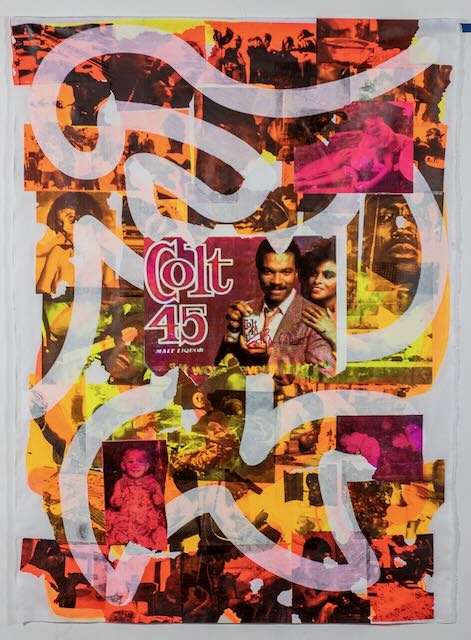
Coleman explains that Jolly Good Company and Dream Lover were influenced by Colin Kaepernick’s decision to kneel during the national anthem during the 2016 season with the San Francisco 49ers, noting that “I just realized that I needed to be talking about the issues that impacted me.” These pieces center on the history of “blackface minstrel.” Source: https://www.csusignal.com/art/article_2d6cb0d6-a862-11eb-8ee7-0b59fe7ff3e8.html
Art Hazelwood
The prints by Hazelwood(born 1961, Concord, MA) included in New to the Collection: Prints Acquired from 2018-2021 are part of a larger collection of work generously donated by the artist, including from the series Pandemonium 2020. Hazelwood has created politically charged prints for over 25 years, working with dozens of organizations from arts organizations to unions to grassroots movements. Over that period he has been consistently involved with homeless rights, including working with the Western Regional Advocacy Project, where he is the Minister of Culture. In 2017, he received the Artwork as Revolution Award from the Coalition on Homelessness. He taught at the San Francisco Art Institute where he was involved in union bargaining for adjunct faculty. While at the Art Institute he was part of the founding of the San Francisco Poster Syndicate, which has brought together political poster makers from various levels of experience and backgrounds to create art for activist organizations. Source: www.arthazelwood.com
Hazelwood explains that “2020 unleashed the apocalypse on the world in the form Covid-19, fascist leaders, climate disaster. It removed the veil from the face of racism, inequity, and economic injustice. As we came face to face with so much disaster both personal and global my response was to reach for satire. Using an array of historical satirical magazine mastheads I created a running commentary on the state of our pandemic pandemonium. Starting with Gaceta Callejera the magazines included Charivari, well known as the vehicle for Daumier's satirical lithographs, and on to Harper's Weekly, Le Rire, Die Aktion, Simplicissimus, Die Pleite, the New Masses.” Source: http://arthazelwood.com/artist/books-folios/pandemonium/pandemonium.html
San Francisco Poster Syndicate
Screenprints 2018-2020
Generously donated by the artists
The San Francisco Poster Syndicate creates and prints original screenprints “continuing the rich history of posters as a form of political messaging. They print the posters ‘live’ at political actions, exhibitions, and on the street, giving away the work for free in order to target a variety of current social and economic justice issues.” Source: https://sfpostersyndicate.com/about/
Katherine Venturelli and Linda Katzdorn-Austin
Oh, say can you see…?, linoleum relief on kozo paper with dowels and cord, 2005
Generously donated by the artists
Venturelli (born 1947, Los Angeles, CA) is an artist and educator, recognized for creating unique artist books and fine prints produced from her printmaking studio in California. Her works are held in collections throughout the United States. Inspired by the power of symbol, universal order and meditative intimacy; she explores the various printmaking forms and artist book structures. Source: https://abecedariangallery.com/store/product/katherine-venturelli-lunar-calculations/
Katzorn-Austin (1947-2021) received her BA and MA from California State University, Sacramento, and was a prolific Sacramento-based artist and educator.
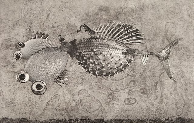
Wangechi Mutu
Fish Mother, lithograph, 2014. Printed at Edition Copenhagen
Mutu (born 1972, Nairobi, Kenya) lives and works in New York and Nairobi. She received her MFA in Sculpture form the Yale School of Art, and BFA from the Cooper Union for the Advancement of the Arts and Sciences, New York. “Mutu's work has directed the female body as subject through collage painting, immersive installation, and live and video performance all the while exploring questions of self-image, gender constructs, cultural trauma, and environmental destruction, as well as notions of beauty and power.” Source: https://www.tate.org.uk/art/artists/wangechi-mutu-7677
She is “best known for spectacular and provocative collages depicting female figures—part human, animal, plant, and machine—in fantastical landscapes that are simultaneously unnerving and alluring, defying easy categorization and identification. Bringing her interconnected ecosystems to life for this exhibition through sculptural installations and videos, Mutu encourages audiences to consider these mythical worlds as places for cultural, psychological, and socio-political exploration and transformation.” Source: https://www.brooklynmuseum.org/exhibitions/wangechi_mutu/
Lesley Dill
Girl Articulated, lithograph and collage, 2007
Dill (born 1950, Bronxville, New York) is an American artist working at the intersection of language and fine art in printmaking, sculpture, installation and performance, exploring the power of words to cloak and reveal the psyche. Dill transforms the emotions of the writings of Emily Dickinson, Salvador Espriu, Tom Sleigh, Franz Kafka, and Rainer Maria Rilke, among others, into works of paper, wire, horsehair, foil, bronze and music— works that awaken the viewer to the physical intimacy and power of language itself. Dill has had over one hundred solo exhibitions. Her artworks are in the collections of many major museums, including the Metropolitan Museum of Art, the Museum of Modern Art New York, and the Whitney Museum of American Art. In 2017 she was named a fellow of The John Simon Guggenheim Foundation and is a Joan Mitchell Foundation Creating A Living Legacy artist and grant recipient. Source: https://www.lesleydill.net/about
This print was purchased as the 2019/2020 Janet Turner Prize for Excellent in the arts, in honor of Curator Emerita Catherine Sullivan.
Jiha Moon
Day for Night, screenprint with chine-collé, 2008
Moon (born 1973, Daegu, South Korea) is from Daegu, Korea and lives and works in Atlanta, GA. She received her MFA from the University of Iowa. Her mid-career survey exhibition Double Welcome: Most everyone’s mad here, organized by Halsey Institute of Contemporary Art and Taubman Museum has toured more than 10 museum venues around the country until 2018. Her gestural paintings, mixed media, ceramic sculpture and installation explore fluid identities and the global movement of people and their cultures. She explains “I am a cartographer of cultures and an icon maker in my lucid worlds.” She takes cues from wide ranges of history of Eastern and Western art, colors and designs from popular culture, Korean temple paintings and folk art, internet emoticons and icons, fruit stickers and labels of products from all over the place. She often teases and changes these lexicons so that they are hard to identify, yet stay in a familiar zone. Source: http://jihamoon.com/pages/bio/
Donna Day Westerman
Osculation, archival pigment print form wood matrix with dry point, 2021; and Generation Woodcut, 2014
Generously donated by the artist
Westerman (born 1940, USA) grew up in Ontario and Michigan and attended the Detroit Institute of Arts and Crafts and the University of Michigan. She received her BFA and MFA from the Otis Art Institute in Los Angeles. She taught for 32 years at Orange Coast College (20 of the years as department chair) teaching courses in printmaking, painting, experimental painting, illustration, life drawing, color and design, computer graphics, set design and humanities. She is Past President of the Los Angeles Printmaking Society and is a member of the California Society of Printmakers and the Southern Graphics Council International. Westerman lives in the Bay Area and works out of her studio in Oakland’s warehouse district. Source: http://donnawesterman.com/biography.html
Westerman explains that Generation, a 6-piece woodcut/installation, “was inspired by my late husband, Charles Harris, a professor of chemistry at UC Berkeley and avid windsurfer. It is my interpretation of his explanation of how the weather patterns start over the Himalayas and the Great Plain of China and the highs and lows begin their oscillation over the Pacific, determining the wind direction as they reach the San Francisco coast.” She further explains that “Osculation” is defined as ‘A contact: as between two curves or surfaces, at 3 or more common points. Or, a point at which two branches of a curve have a common tangent, each branch extending in both directions of the tangent. Or; kissing.’ This piece started out as a reduction print by after the third color was printed the entire edition mysteriously disappeared from the studio. There years later, during the Covid lockdown, I decided to have the wood matrix photographed and printed life-sized as an archival pigment print which I could then overprint with drypoint, emphasizing the same shapes as the original. In the first printing, the digital print was mistakenly placed backwards on the drypoint. Eureka!! A kiss for all the mistakes we make!” Source: Westerman’s note to Turner Museum included with donation (8/27/21)
Miguel A. Aragón
Tomando evidencia forense and Espectadores from the series Memoria Fracturada, burnt residue embossing, 2012
Aragón (born 1978, Juárez, México) is an Associate Professor of Printmaking at CUNY College of Staten Island. He received his MFA from the University of Texas, Austin and his BFA from the University of Texas, El Paso. Aragón’s works explore subjects of violence, transient and/or persistent memory, perception and the multiple; he uses erasure as language through the use of processes that are reductive in nature.
Both prints are from the series Memoria Fracturada which focuses on “drug-related violence” in México by “using metaphors and visual metonymies to tie together process and subject matter, I explore the idea of perception, memory and transformation. My work is derived from a need to find meaning in these brutal events that re-positions the corpse in our field of vision, reminding us that our physical existence is a temporary one.”
“Beginning with the idea of erasure as language, I started to create this body of work through the use of a laser-cutter. This is a violent process since it uses, via a computer, the output of a high-powered laser to create cardboard matrices. The cardboard burns through, leaving a layer of soot on the surface allowing me to then transfer it to paper. By only using the burned pigment as the source of mark-making, I am playing with the idea that those events are burned into the consciousness of the city’s inhabitants — leaving unwanted memories though continuous first-hand exposure to these massacres, shaping the way in which they continue to live their life just as the burned residue leaves a permanent imprint on the paper. There is some variation in tones along with different thickness of embossing, once the cardboard matrixes are printed onto paper, which alludes to a more physical degree on the impact of the events – the varying degrees of impact and permanence.” Source: http://aragonmiguel.com/Prints from Trumped 2.0
Trumped 2.0, portfolio of political lithographs by twenty-eight artists, organized by Richard Peterson and Beauvais Lyons, 2020
Generously donated by the artists
Stephanie Alaniz received their BFA from Texas A&M and MFA from West Virginia University. Their print We Are What Make America Great (lithograph and screenprint, 2020) is “a celebration of marginalized ‘folx’ who exist in America and are what make America Great.”
Andrew DeCaen is an Associate Professor of Art and the coordinator of the printmaking program at the University of North Texas. He received his BA from the University of Dallas, and MFA from the University of South Dakota. His print Drop-Leaf (lithograph and screenprint, 2020) imagines “what it would be like to experience disillusionment after admiring [Trump] for so long. Melania and Barron Trump are imagined as metaphoric surrogate for so many people who have felt the need to be loyal in spite of themselves.”
Dan Heskamp received his BFA from Northern Illinois University and MFA from Texas A&M. He is art faculty at the College of the Sequoias and California State University, Stanislaus. His print Soft-Spoken (lithograph and screenprint, 2020) overlays quotes by President Trump on the White House, and was “created out of an interest in architectural drawing along with text and image.”
Kimiko Miyoshi was born in Japan and received her MFA in Printmaking from the University of New Mexico. She teaches printmaking at California State University, Long Beach. Her print unravel it (lithograph and silkscreen, 2020) “conveys the visceral reaction I had for the political events of the last four years.”
Erika Navarrete received her BFA in painting and art history from the Kansas City Art Institute and her MFA from the University of Nebraska, Lincoln. She is art faculty at the University of Southern Indiana in Evansville. Her print Ignorance is Bliss (lithograph, 2020) “comments on the disturbing way a whole section of society has chosen to ignore science and facts in exchange for disinformation and conspiracy theories.”
Peter Nickel received his BFA from California State University, Long Beach and his MFA from the University of Texas at Austin. He has taught as faculty and visiting artist at multiple universities, including the University of Texas, University of South Dakota and Southwestern University. His print Iapetus (lithograph, 2020) is a comment on the fact that “we are in the ring of participation. When we respond, we participate, no matter what the response is.”
Kathryn Polk studied at the Memphis Art Academy and University of Memphis. She has exhibited her work widely, in the United States and internationally. Her print Waist Deep in the Big Muddy (lithograph, 2019) references “a protest song written by Pete Seeger in 1967” about a “foolish authoritarian leading us toward destruction. The figure carrying a log (a symbol for obstacles and personal trials) is determined not to give up but to keep believing that things will change for the better if she keeps trying.”
"The Fierce Urgency of Now": A Juried Exhibition of Socially Engaged Printmaking
February-April, 2022
This juried exhibition explores the compelling work of activist and socially-engaged contemporary printmakers.
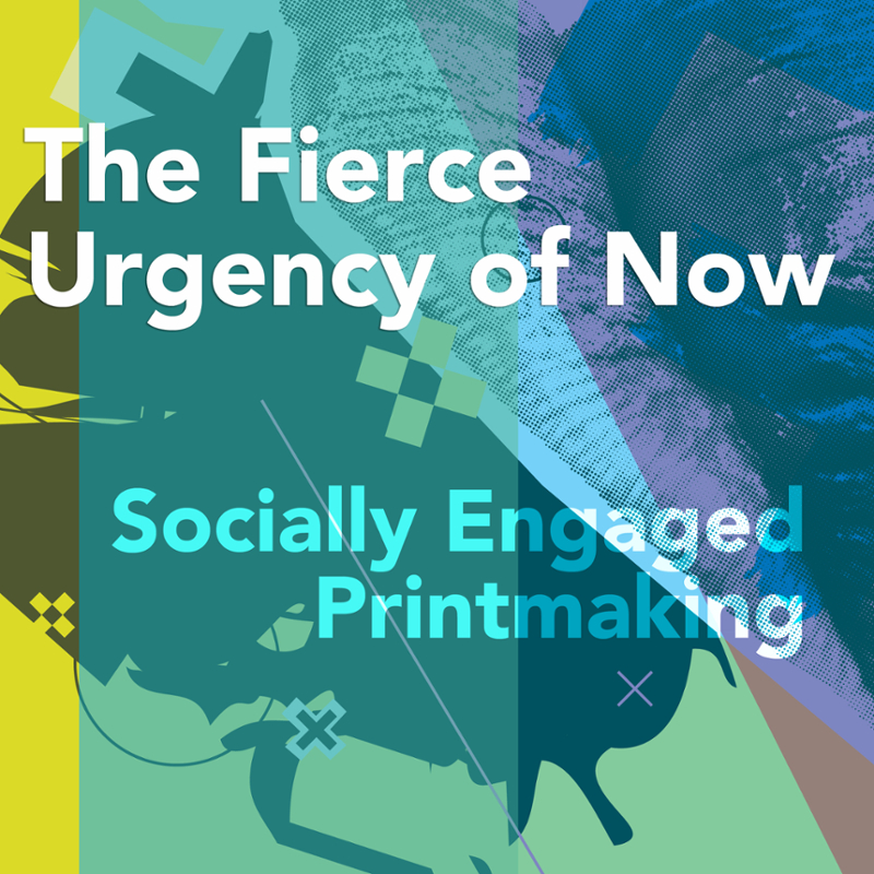
Generously sponsored by David Hopper and Shari Maxson Hopper
- Events
Juror Talk: "The Fierce Urgency of Now: Socially Engaged Printmaking"
Thursdsay, February 17, 5:30 p.m. | Recital Hall, Arts and Humanities Building, followed by a visit to the Turner Museum to view the exhibition
Face masks required
Juror Printmaking Demo: Hybrid Techniques in Etching
Thursday, February 17, 11:30 a.m.Juror Artist Talk
Friday, February 18, 3:00 p.m. | Arts and Humanities Building 111
Face masks required
Jacob Meders, “Too Many Capitalists Not Enough Indians: Indigenous Adjustments in the Western Narrative"
Co-sponsored by the Book in Common and the Janet Turner Print Museum
Thursdsay, February 24, 5:00 p.m. | Zoom
Meders (Mechoopda/Maidu) is an Assistant Professor in the New College of Interdisciplinary Arts & Science at Arizona State University. He received a BFA in painting with a minor in printmaking from Savannah College of Art and Design and an MFA in printmaking from Arizona State University. In 2011 Meders established WarBird Press, a fine art printmaking studio that he operates as the Master Printmaker in Phoenix, AZ.Meders has exhibited his work in Divided Lines at The Museum of Contemporary Native Arts in Santa Fe, NM, Agents of Change: An Exhibition of Artist’ Books with a Social Conscience in Gallery 31 at the Corcoran, Washington DC, Something Old, Something New: Nothing Borrowed Recent Acquisitions from the Heard Museum Collection at The Heard Museum in Phoenix, AZ, Transcending Traditions at Mesa Contemporary Arts in Mesa, AZ, ‘Akkum Belle:Afterwards at Jackie Headley Art Gallery, Chico State, Chico CA, First Americans: Honoring Indigenous Resilience and Creativity at Museum Volkenkunde, Leiden, Netherlands, and Mini WiconiGoldsmith, University of London.Meders' work focuses on altered perceptions of place, culture, and identity built on the assimilation and homogenization of indigenous people. This work often ties into current issues faced in Indigenous communities. His work touches many interdisciplinary approaches and repeatedly plays with the boundaries of social engagement practices. His work continues to reexamine varied documentations of Native Americans through printing processes that hold onto stereotypical ideas and how they have affected the culture of the native people. Often using book forms and prints as a symbol of western knowledge and the linear mind, he deploys them as a vehicle to challenge new perceptions of Native Americans. - About the Juror
Aaron S. Coleman
Aaron S. Coleman is an Associate Professor of Art at the University of Arizona. He received his MFA from Northern Illinois University in 2013 and BFA from Herron School of Art and Design in 2009. As a teenager and young adult Aaron was active in the local Hip-Hop and Graffiti scene in Indianapolis and both remain as major influences in his fine art studio practice and philosophy. As the son of mixed-race parents, Aaron’s life experiences have instilled in him an interest in sociopolitical engagement and social justice work. These experiences are the guiding forces behind the work he creates.
Aaron has exhibited internationally and received numerous awards, scholarships and fellowships for his work in lithography and mezzotint. His work can be found in the collections of The Janet Turner Print Museum, The University of Colorado, Wichita State University, the Ino-cho Paper Museum in Kochi, Japan, The Yekaterinburg Museum of Art in Yekaterinburg, Russia, the University of Tennessee Knoxville’s Ewing Gallery Collection, and The Artist Printmaker and Photographer Research Archive among many other public and private collections.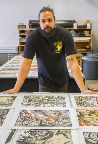
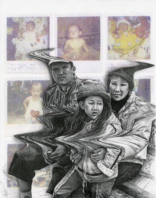
Thuong Tran | Family's First Arrival | Lithography, Screenprint | 2020
M. Robyn Wall | Process of Migration | Screenprint | 2019
Rozanne Hermelyn Di Silvestro | Sit Like a Lady 1 | Monotype | 2021
Cameron York | Hot Chips | Intaglio | 2019
Nanette Wylde | Milagros for Times Like These VI | Lithograph, Screenprint | 2021
Lisa Turner | Future Memory #1 | Screenprint | 2021
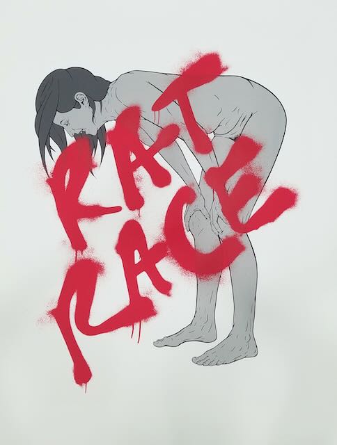
Tonja Torgerson | Rat Race | Screenprint | 2021
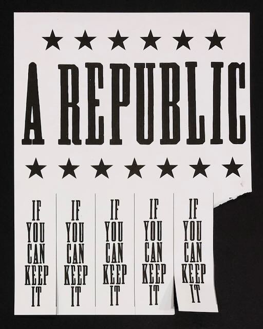
R.L Tillman | If You Can Keep It | Risograph | 2020
Robynn Smith | 16mm | Solarplate Etching | 2019
Robynn Smith | August #15 | Linocut, Collage, Chine-collé | 2020
Sarah Sipling | Protest (Print) 20 | Screenprint, Lithography, Collage | 2021
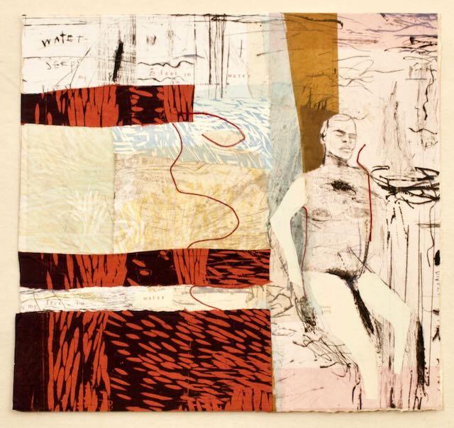
Terry Schupbach-Gordon | My Feet in Water | Intaglio, Woodcut, Collage | 2021
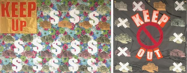
Blake Sanders | Keep Up/Keep Out Protest Flags | Screenprint on Repurposed Fabrics with Appliqué and Reverse Appliqué Stitching | 2019
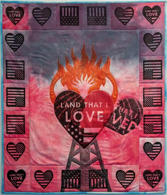
Aaron Pozos | Love(d) | Quilted Woodcut | 2021
Nathan Pietrykowski | The Distance Between Similarities | Screenprint | 2021
Nathan Meltz | Elon, Take Me With You! | Screenprint | 2021
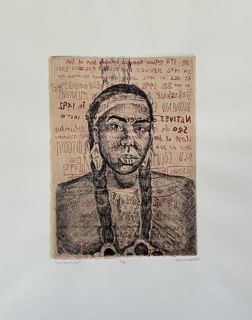
Karina McMillan | Storytelling | Intaglio, Chine-collé | 2021
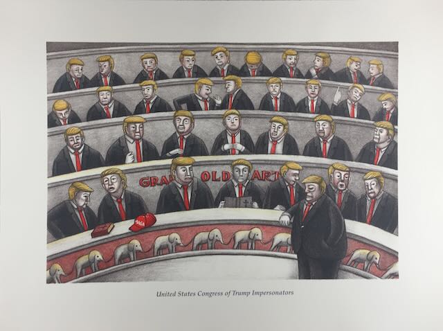
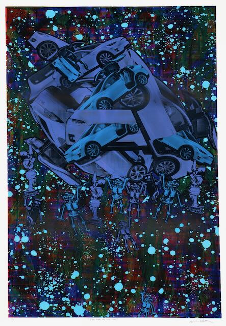
Beauvais Lyons | United States Congress of Trump Impersonators | Lithograph | 2020
Nguyen Ly | Altered Faces 1 | Drypoint, Collage | 2021
Eddy Lopez | Afghanistan II | Screenprint, Digital Print | 2021
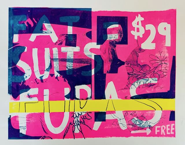
Veronica Leto | Fat Suits + Fupas | Screenprint | 2021
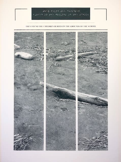
Amanda Lee | Accretion of Knowledge, Wilhelmina, They Found the Children | Screenprint | 2021
Christina Kang | The Ripest Parts of Me | Photo-Lithograph | 2019
Humberto Saenz | Limpiador de Ventanas | Lithograph, Screenprint | 2018
Angelea Heartsong-Redding | State of Affairs Pt. 3 | Screenprint | 2021
Cameron Gray | President’s Day | Screenprint | 2018
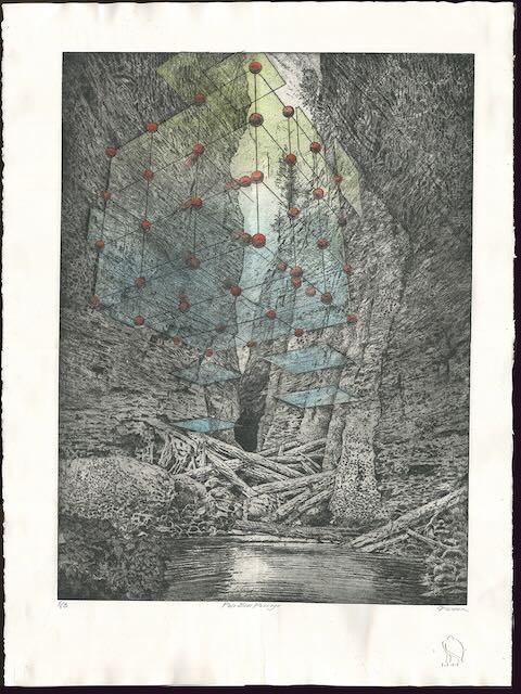
Craig Fisher | Pale Blue Passage | Aquatint, Sugar Lift, and Chine-Colle | 2020
Juana Estrada Hernandez | Nopalaso en nombre de Nuestras Familias | Lithograph | 2021
Justin Diggle | Invasive Aquatic Surveillance Bio-Drone (Genetically Enhanced) | Photo-Etching | 2019
Dadisi Curtis | Convenient Propaganda | Screenprint | 2021
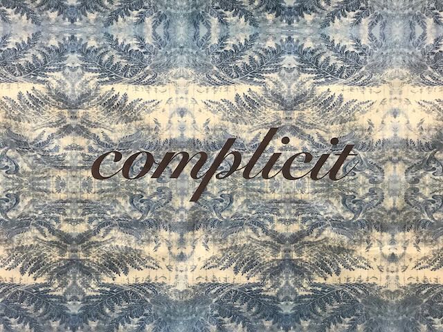
Teresa Cole | Complicit | Screenprint, Puff Ink, Velvet | 2019
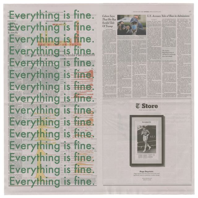
Danqi Cai | Everything is Fine | Screenprint | 2020
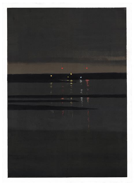
Rachel Burgess | The Bridge at Night (Piece #73 for 100 Views of the Piscataqua) | Monotype | 2021
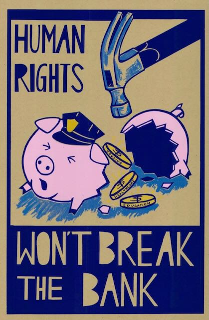
Nancy Ariza | Human Rights Won't Break the Bank | Screenprint | 2020
Juana Alícia | Requiem for Elijah | Screenprint | 2020
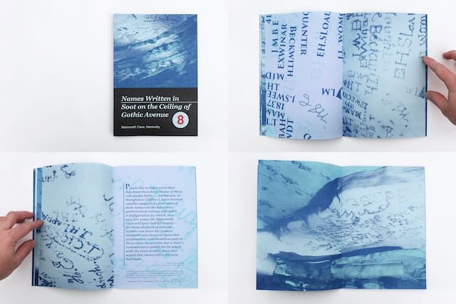
Alex Lukas | Keep Written Names #8: Names Written in Soot on the Ceiling of Gothic Avenue, Mammoth Cave, Kentucky | Risograph Publication | 2020
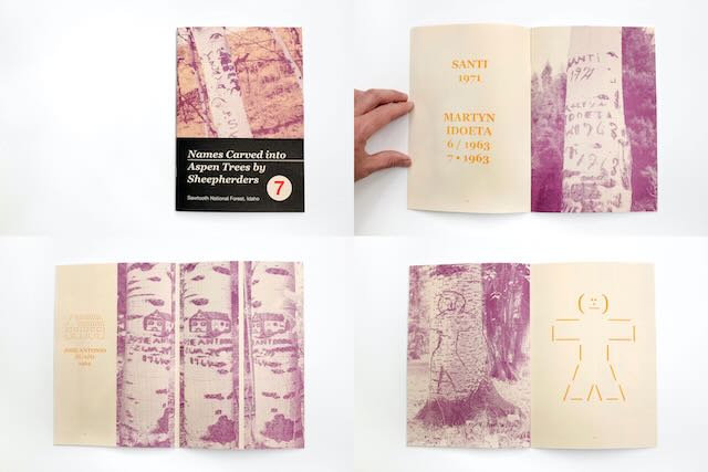
Alex Lukas | Written Names #7: Names Carved into Aspen Trees by Sheepherders, Sawtooth National Forest, Idaho | Risograph Publication | 2020
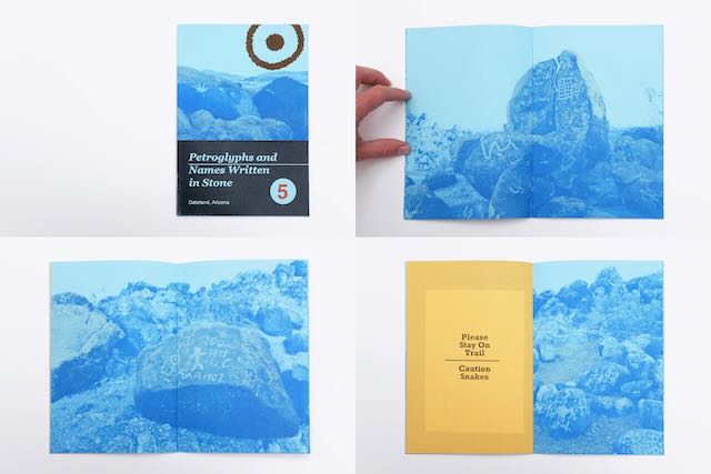
Alex Lukas | Written Names #5: Petroglyphs and Names Written in Stone Dateland, Arizona | Risograph Publication | 2020
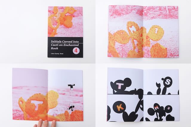
Alex Lukas | Written Names #4: Initials Carved into Cacti on Enchanted Rock, Llano County, Texas | Risograph Publication | 2020
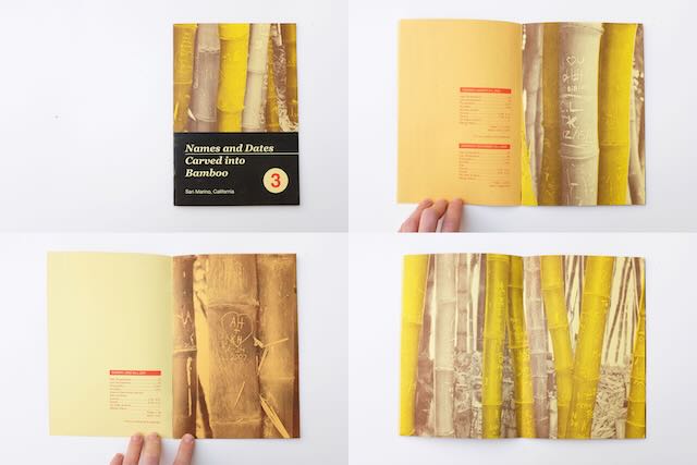
Alex Lukas | Written Names #3: Names and Dates Carved into Bamboo, San Marino, California | Risograph Publication | 2020
26th Juried Student Print Exhibition and 19th Ink & Clay
April-May, 2022
This annual Juried Student Print Exhibition showcases outstanding student work in printmaking, complemented by corresponding works of excellence in ceramics.
Awards Ceremony for student exhibitions sponsored by Janet Turner Print Museum, Jacki Headley University Art Gallery and Department of Art and Art History’s Art Education area. All galleries open for receptions following the presentation.
Juror Talk
Tuesday, April 12 | 5 p.m. | Ayres Hall 201
Awards Ceremony
Thursday, April 28, 5 p.m. | Arts Recital Hall | reception to follow.
Juror: Golbanou Moghaddas
Golbanou(opens in new window) is an Iranian Narrative Visual Artist based in San Francisco. She moved from Tehran to London in 2008, where she completed an MA in communication design at Central Saint Martins, a constituent college of the University of Arts London. She is a winner of the Best of British Illustration award (2011), and illustrator of The Book of Barely Imagined Beings, published by Granta Publications and the University of Chicago Press. In 2012 she was awarded an MFA Fellowship from the San Francisco Art Institute, which brought her to the West Coast. In the Bay Area, she has worked with master printer Paul Mullowney. She is a recipient of the Murphy and Cadogan Contemporary Art Award (2013), a Manhattan Graphics Center Scholarship (2017), and a Kala Art Institute Fellowship award (2017–18). Her work was selected for the International Print Center New York (IPCNY) New Program: Winter 2018, and the 1st International Juried Print Biennale India. She has exhibited internationally at the Museum of London, Kensington Palace and Bankside Gallery in the United Kingdom; ORi Gallery, Berlin; Empreinte Atelier de Gravure, Luxembourg; and the SOMArts Cultural Center, Richmond Art Center, San Francisco Center for the Book, Arc Studios & Gallery, The Peninsula Museum of Art, the San Francisco Public Library's Skylight Gallery, and International Print Center New York, in the United States. She recently completed a commission for Ma Carte Des Merveilles, a science and philosophy book released by Les Belles Letters, a renowned publishing house based in Paris, France. Currently, Golbanou is an Artist-in-Residence at Kala Art Institute in Berkeley, and a 2018 Affiliate Artist at Headlands Center for the Arts in Sausalito.
Juror: Sue Whitmore
Sue Whitmore is an artist, designer, and educator working in the field of ceramics. Raised in Colorado, she attended Metro State University in Denver and received a Masters of Fine Arts from the University of Washington in Seattle. Interested in the intersection of science and art, her work has explored the imagery of natural science and entomologic hybrids in abstract and realistic forms. Her experience in ceramics and sculpture and work as a science illustrator, a land surveyor for the U.S. Forest Service, and as an exhibition specialist for the California Academy of Sciences has helped form a unique line of inquiry into object and image-making. Her current work explores the synthesis of digital and ceramic processes and the combination of post-consumer paper products and organic materials with ceramic materials.
Summer, 2021
The City
June-July, 2022
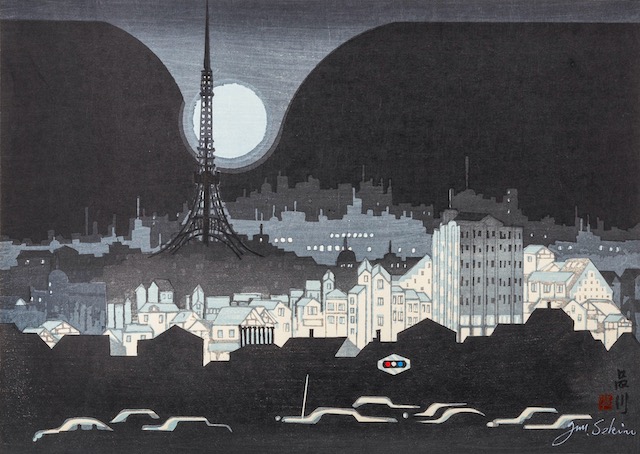
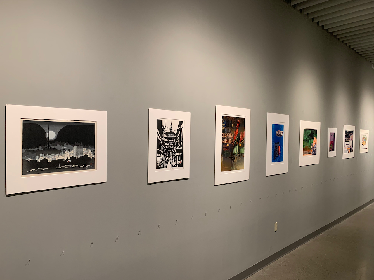
Junichiro Sekino | Shinagawa | Woodcut | c.1960
- Curated by Students in Humanities 400, Spring 2022
This exhibition is curated by students in Dr. Laura Nice's Humanities capstone seminar: Allison Bernardi, Owen Cross, Lizzie Eickmeyer, Amelia Hain, Benny Gutierrez, Grace Harrison, Alexandria Jimenez, James Lawrence, and Brett Stewart.
More than half the world’s population currently lives in cities, and by 2050 it is projected that urban dwellers will account for 2/3 of the global population. This represents a remarkable and swift shift in population (around the year 1800 3-5% of the global population lived in significantly urban areas). Students in the capstone Humanities seminar explored ideas of the city and urban community in spring 2022, and collaboratively curated this online exhibition of prints from the Turner collection by thinking about the historical and contemporary uses and approaches to urban environments. We delved into Tommy Orange’s There There and Italo Calvino’s Invisible Cities, as well as readings by Georg Simmel, Charles Baudelaire, Virginia Woolf, Ibram X. Kendi, Julie Sze and David Harvey. Students were asked to respond to prints in whatever way they chose, based on our readings and their exploration of the print.
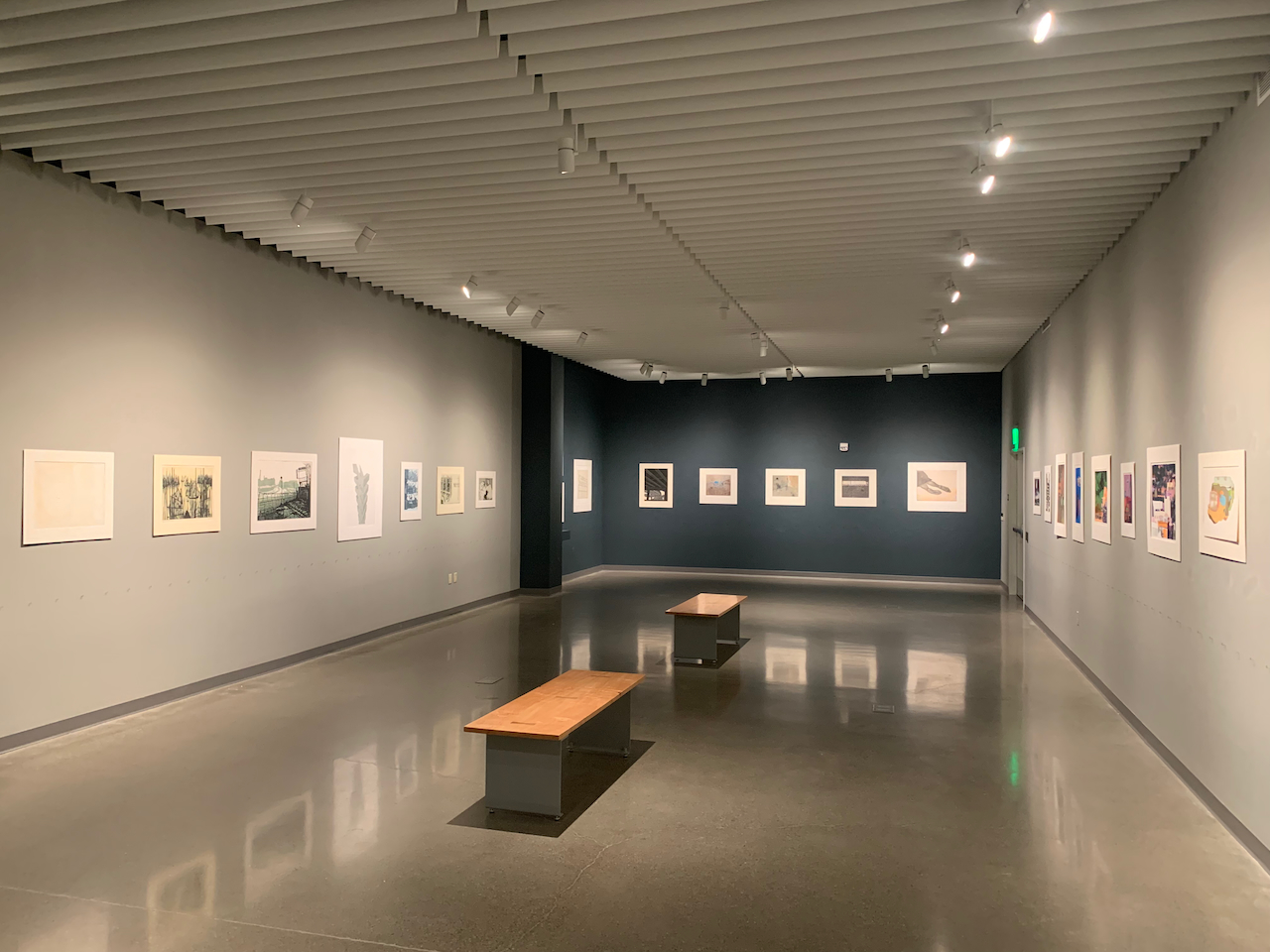
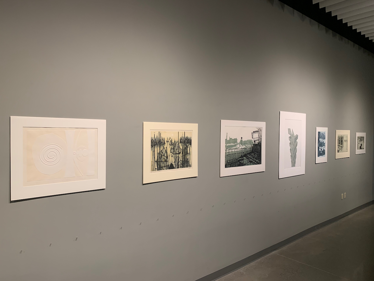
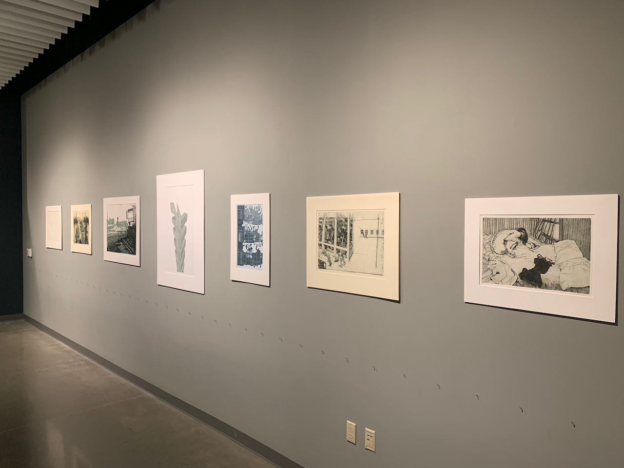
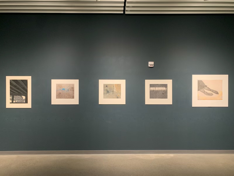
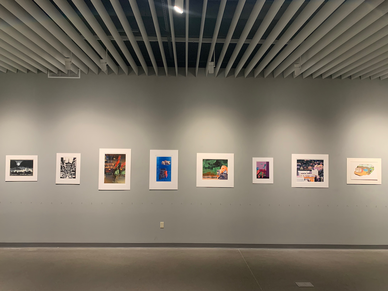
- Gallery Installation Views
- Exhibition Prints and Student Labels
Junichiro Sekino | Shinagawa | Woodcut | c.1960
By Brett Stewart
“Moonlit Tokyo” offers an alternative perspective on the city of Tokyo. The full moon in the background sags low in the sky, resisting the darkness surrounding it, urging to push it upward. And like a mirrored pool, the city below has a central district still alight with activity and shinning as bright as the moon above. Equally resistant of the surrounding darkness, which the artist uses to focus the eye towards the balanced forces of life during the night. Natural light takes the form of a full moon, while human sourced light takes the form of those powered by electricity.
This piece does a great deal of work to underline the affects of light polution on urban skylines and humankind’s power over nature. The sky is lightless save the moon, a reality that comes as a result of light pollution from electrical lights. When was the last time you looked over a city and saw a sky full of stars? In the balance of light sources between nature and humanity, the moon is portrayed as giving everything by virtue of being full. Yet one can’t help but wonder should the city have been fully lit, would the full moon be as clear of a focus to the eye?
Valerio Adami | Derrière le Miroir | Lithograph | 1970
By Owen Cross
I’m trapped. I’ve got work to do ---soon---sleep to do now. My apartment has no door. If I’m lucky, one will appear at 6 or maybe earlier, and I can head out to the office. But for now, I’m trapped.
I see myself lying there, exhausted, asleep, and ready for work. In bed with my shoes on.
I see myself---passed out on the cot bellow, shoes on. I usually don’t remember coming back the apartment at night, but this time I do. I had figured if I stayed at the hotel bar long enough, I could skip my apartment and go straight to the office in the morning. I don’t remember much else from the hotel, but I can recall every single step back home. Each foot a plastic bucket of water, scraping along the warm, dark pavement.
I guess it is home now, I never wanted it to be.
I had always wanted to work in the city—to play with the big dogs, to prove that I had what it takes. I had potential, but it always seemed to stay at just that: potential.
I couldn’t uproot my family. I would rent a small apartment downtown, and commute into the city each week---return home on Friday.
At first it was great. Life was simple. While in the city, all my energy was focused on work. I could stay late, and no one expected me home for dinner. I can eat out. Why cook? No friends, no family here, just a purpose.
I imagine that this simplicity is like what monk might experience. No, there is nothing spiritual or holy or remarkable about my lifestyle, but I too was free from distractions. For 5 days each week my life was devoted to this sole purpose.
My boss asked me to work a Saturday: impending deadlines.
Two weeks later I worked the whole weekend. Never went home. Twelve days straight. It wasn’t bad.
Twelve-day work weeks became normal.
I’ve been sick for a week now. It’s been 3 since I’ve left the city. Busy at work and I like it there---but not here.
I’m trapped. In my apartment with no door. I wish I was alone, or at work, but I see myself.
I come home with take out, finish most of it. Fall asleep at the dining table.
I see myself. Emerge from bed, clearly’ve been awake. Nearly trip over myself, still asleep at the dinning room table. I finish the takeout for breakfast---still slightly warm. Out the door.
I’m still here, trapped in my apartment with no door. Forced to watch myself return, sleep, lie awake and then leave for work. I come and go at all hours. It never stops.
I’m stuck here, but they come and go.
I wish one would pause, and for me, hold open the door.
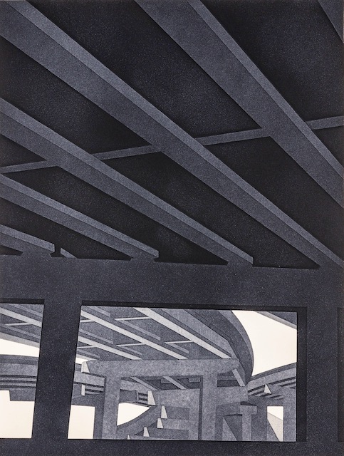
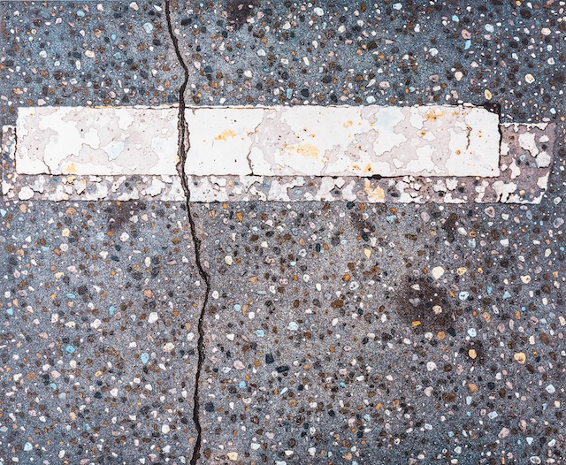
Leo Van Staveren | El Paso VI | Aquatint | 1976
By Grace Harrison
Harvey Milk once said, “A city isn’t a collection of
buildings—it isn’t a downtown with the B of A and
Trans-America Tower, it isn’t the parking lots or
the freeways or the theatres or the massage
parlors. A city is people.”
“El Paso VI” focuses on the bottom layer of a dark,
ever-expanding freeway system, Interstate 10, of
El Paso, Texas. The viewer is forced to look up and
away into the freeway’s underbelly, taking notice
of its dark slabs of concrete and open spaces
leading to yet more slabs of concrete. There are
many perpendicular lines and squares that make
the freeway feel rigid and structured. There are no
people. The opposing grey and black lines lock the
viewer’s eyes into its large scale and potential,
closing in on whatever thoughts or beliefs the
viewer may have. It reminds us of the largeness
and vastness of how one may feel passing by or
living in a city. Van Staveren’s portrayal of a
freeway is overwhelming to the eye and suggests
that it is the structures of a city that dominate
over the people living there. Italo Calvino, author
of Invisible Cities, once said that “the city says
everything you must think, makes you repeat her
discourse. . . you are only recording the names
with which she defines herself of all her parts.”
George Simmel agrees, arguing that an individual
inhabiting a city “has become a mere cog in an
enormous organization of things and powers
which tear from his hands all progress, spirituality,
and value in order to transform them from their
subjective form into the form of a purely objective
life.” Perhaps a freeway, with its many paths
creating the web and interconnectedness of a
city’s parts, isn’t as freeing as one may believe.
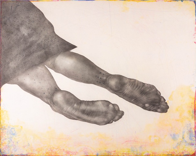
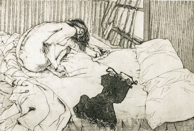
Kiki Smith | Still | Etching, Spit Bite, Aquatint, Flat Bite, Softground, Hardground | 2006
By Benny Gutierrez
Trespassing? Just tired….
Hauling about the things she’s acquired
No place to call her own
People say the meanest things
In passing
But the worst is “all alone”
The sidewalk has compassion
Stable. Still…
A friend to those cast out against their will
Without condition
Oasis beyond the street
A soothing place of respite, this blessed patch of concrete
You’ll never hear the sidewalk say, “no”
“Get a job” “move along now” or “just clean up your mess and go”
It's safer here, in fact
Before God and all to see
Sleep is hard enough to come by
Without fear of harm or some penalty
Trespassing?
She only needs to rest
Some father’s daughter
Hungry, soiled and depressed
The sidewalk has compassion
We could easily do the same
The sidewalk knows her story
And calls to her by name
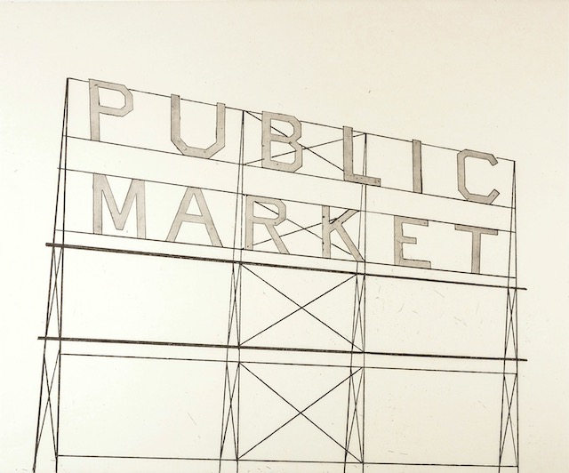
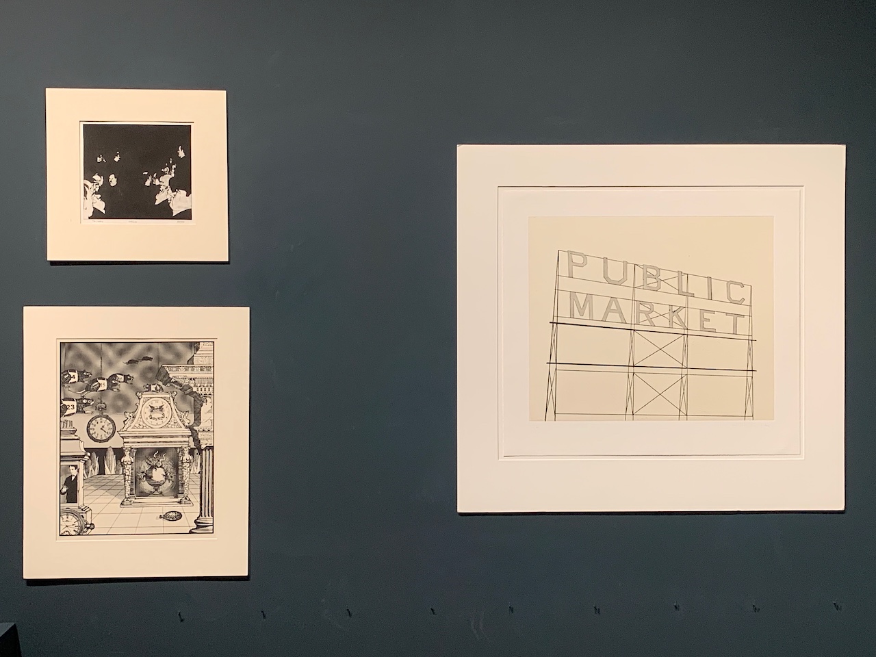
Ed Ruscha | Public Market | Etching, Sugar Lift, Chine Collé, Flat Bite, Hardground | 2006
By Benny Gutierrez
/ˈpəblik/
Adjective 1. Of or concerning the people as a whole.
We’re all welcome at the public market. As long as you’re buying. You’re welcome. Come and see the many stalls of seasonal fruit, scented candles and fresh cut flowers. It’s open to the public and you’re welcome. Unless your clothes are all wrong. Then it’s no place for you. Try the 7-11 down the street, perhaps. Here we have organic mushrooms and live music, cold pressed juices and petitions to sign. It’s the public market! And everyone’s welcome. Unless your politics are different. Maybe there’s a bake sale that would better suit your tastes. Here you’ll find assorted nuts and ceramic ashtrays, hand crafted furniture and knitted caps. You’re welcome. It’s the public market. It’s open to the public. But maybe it’s just not the place for you. It’s the public market.
Yueon-Gayh Yehp (Bill Leaf) | Ginseng Theatre | Mixed Media, Xerox, Heat Transfer | 1994
By Allison Bernardi
“The city, however, does not tell its past, but contains it like the lines of a hand, written in the corners of the streets, the gratings of the windows, the banisters of steps, the antennae of the lightning rods, the poles of the flags, every segment marketed in turn with scratches, indentations, scrolls.”
-Italo Calvino Invisible Cities pg. 11
A vermillion premolar entwins its roots with the central image. Cities consume the armatures of the mind, their landscapes faceting against the fissures of perception. Ginseng Theater gazes into the pool of memory; unable to expunge nostalgia. These fragmented images are perhaps pieces of memory left to adorn the mind, but never to be spoken aloud. We gaze at the figure who will never adjust his to meet ours. He exists in a time outside our own, we explore the honeycombed images, sipping the sweet nectar of multicolored memory. Suspended in perpetual azure the language of the past is scrawled, hazy to the eye. Cities do not tell their pasts; we must investigate their scratches to uncover the unknown. Retelling the past folds memory into a small paper boat and places it into the concentric canals of experience and arrives ashore delicately distilled. We are gifted with unpolished perception, leaving us to find peace in the entanglement.
Alex Lewis | Untitled | Etching | 2015
Warrington Colescott | The Great Moon Trip | Etching | 1972
By Lizzie Eickmeyer
To Fall Means We Could Get Back Up
(a pessimistic view of the city)
Screengazers congregate in concrete,
Their faces languid,
The pigeon cars, beside, remain unflinching at their brutality,
The subjects happy, the suitor perplexed at
the slogan hopeful sky manufactured for owned truth.
Pulled into the clash-collage, the astronaut becomes the actor.
Is this our misplaced responsibility? Can we even ask?
Drift into this dog-land, green, orange, vermillion, blue,
Where we build ourselves on burial ground,
On the hopes of people smaller than us,
On the backs of the frailty we created,
The emphatic singularity of existence, in
The coddled condominiums we call home,
Perpetrated via submission.
The implication is that we must be alone, that we have always been,
When nothing could be further than our mortar truth.
Dorothy Mandel | At the Berlin Wall | Woodcut | 1970
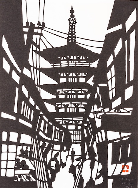
Mikumo | Yasaka Pagoda | Woodcut
Art Hansen | The Lobby | Mezzotint | 1971
By James Lawrence
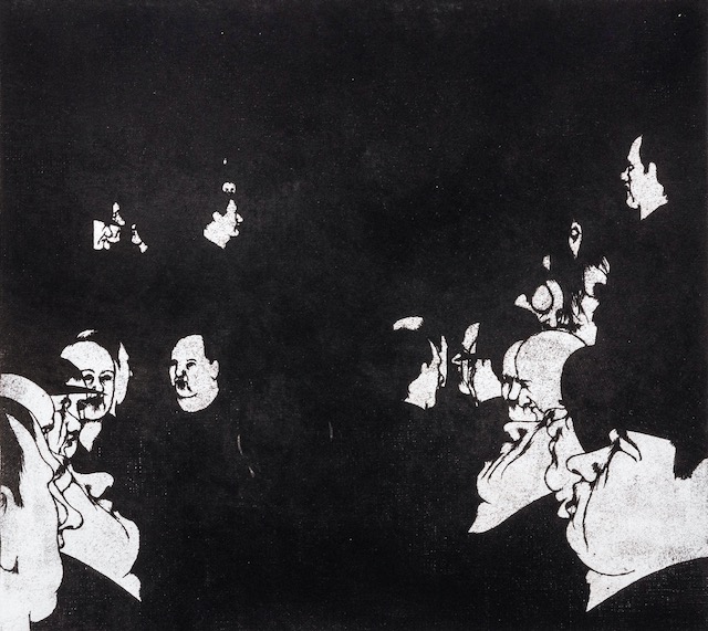
Art Hansen captures the nature of distance and social congruence through his monochromatic work “The Lobby.” In this piece, Hansen places the viewer in the lobby of a hotel, choosing to omit details about the setting and instead focus their attention on the people occupying the space. As a native of Washington state raised on farmland comprising ponds, lakes, and forests, Hansen’s work in pen and ink as well as etching and lithography have provided a fusion of artistic influences from a number of different geographic and cultural styles. With these influences in mind, much of his work focuses on what creates social spaces: primarily, the people that are required to make them social in the first place. The Lobby highlights these preferences by only including details about these people, from the conversations taking place in the background to the individuals observing them in the foreground, Hansen’s work shows a perspective with no clear aim, allowing the viewer the freedom to wander as they would in one of these spaces. In creating a clear focal point that leads to an absence of form, the viewer’s eyes are encouraged to wander from one side to the other in a linear fashion, focusing on the eye contact and social interaction occurring on either side of the frame. Faces dot the periphery, while negative space comprises the vast majority of the area of the work, creating a stark contrast between the people and the place they occupy. Without the people in it, these places mean substantially less.
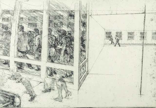
Robert Birmelin | Reflections/Underpass | Etching | 1968
By Owen Cross
I see reflections, but no one is truly there
hear footsteps
see breath
smell coffee
contained by paper no longer hot
Bodies hustle
tightly draped in gray, navy, black
striving to catch up
to minds ahead in the office
I hear voices
never for
just around
… efficient…
…productive…
…profitable…
Avarice.
The city breathes.
exhales
compresses
into eruption, cacophony, intensity
salesperson, ambulance driver and jackhammerer
compete for my attention,
shove me in the corner;
where brick meets concrete
What excitement
What people
What a life
I open my mouth
to reply.
they release me,
turn their backs
Ignored.
The city breathes.
Inhales
expands
opens
beauty
solace
bliss
Sublime.
Every day is peculiar
but for them it is always same
Linda Plotkin | Village Hillside | Lithograph | 1976
By Allison Bernardi
Join me in the garden for a moment. There is a place to be found between the sips of the milk of Paradise, a stillness in the unknown. I feel that is not why you are here, seeking stillness that is. You must know that I cannot guide you to what you do not know. Cities explore the breeching unknown, satiating previously unknown desires, dredging the once barren floor of memory. Villages invite reflection, providing safe passage for the introspective. Perhaps, we should begin with a description before continuing our journey.
When a traveler wishes for respite between cities the Village Hillside appears before them. As villages often are imbued with the evaporative essence of cities surrounding, their forms appear unfocused to the eye. Brief, colorful hatching postulates a desire to rise above the jutting green. Carved from stone, zinc, or aluminum Village Hillside in its man-mad nature still calls upon enclaves of the earth. This is the fate of villages: the desire and flamboyance of man juxtaposed to the unrelenting green. While you may believe that villages, just as cities, embody the desire of man, the burgeoning blade of grass dissects the alabaster edifice, refusing the fate of consumption.
Those who choose to remain in village—building a life among the olive and the artificial—embody a liminal existence. Inhabitants have recognized that no matter where they go, the green will devour them. There is community to be found in such dread, at least in a village someone strips the moss and detritus from the stone that marks your grave.
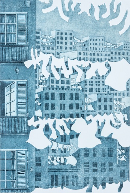
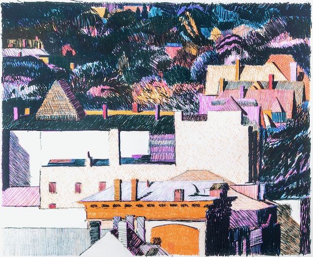
Patricia Babcock | Washday Boogie | Aquatint, Embossing | n.d.
By Alexandria Jimenez
Patricia Babcock gives a glimpse of urban spaces in her print, Washday Boogie. Toppled on one another, a depiction of urban living spaces is captured. She is able to bring to life the mundane, the simple, the day-to-day aspects of city living. Interestingly enough, no people are present in this print, yet, at first glance, viewers can’t help but assume they are. With the drying clothes hanging, being tossed by the wind, shirts and pant legs become animated in a dance-like manner, alluding to the people that wear them. Though people are lacking in this piece, the outlines, and shapes that the clothing forms, inform viewers of the many people living here. The details in the apartment buildings bring a sense of awareness to the urban space being viewed. The broken window panels and the chipped and cracked concrete, hint at the age of the buildings, and the possible income status of its inhabitants. Dimension can be understood with the stacked buildings and the drying clothes hangings in-between them as they get smaller and distant in the background. Viewers can easily be reminded of the heavy population of city life, as well as the spaces that are utilized. Even the empty spaces between the buildings have a purpose in urban spaces such as these ones, such as drying clothes. With this, an idea of city life can be formed, that there are no wasted spaces in urban life, every aspect of space within a city is useful, and needed.
Sigmund Abeles | Black Slip | Etching | 1967
Otto Eglau | Hong Kong | Etching |1964
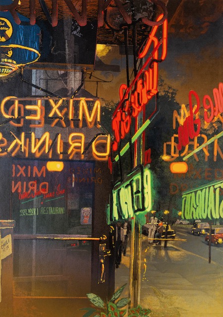
Nancy McIntyre | The Tune Inn | Screenprint | 1979
By James Lawrence
Nancy McIntyre’s work primarily focuses on social areas where the lived-in nature of occupancy provides narratives of the individuals who frequent these establishments, creating an atmosphere that the viewer can immerse and imagine themselves participating in. These scenes provide a sense of place, a location where the character of its patrons bleeds into the setting and begins to shape it through life’s activity.
Tune Inn reflects these values, providing a dimly lit, lived-in social space. The neon signs contrast the sleepy ambiance of the world outside of the establishment, while the panes of glass that surround the viewer’s window into this scene reflect the unknown extension of the streets, people, and world outside of this entryway. Often our thoughts drift to what’s ahead and distracts us from what we’re leaving behind. By choosing these features, the author limits the perspective of the viewer and selectively incorporates only what she deems worth observing, namely the people outside, the cars on the street, and the restaurants surrounding us. The door is open, but they’re just out of focus, only allowing observation of that which lies before us.
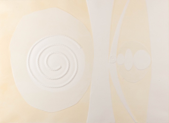
Angelo Savelli | The City Going Moon | Collagraph, Lithograph, Embossing | 1964
By Grace Harrison
Using rope and eleven embossed lithographic
white-on-white pieces, Angelo Savelli created
“The City Going Moon,” a work of “extreme
lightness and formal purity from a compelling
inner need to reach universal simplicity.” Each
shape shares space with one another, however
wide or narrow in dimensions they may be. The
shapes are each connected, offering balance and
support for one another. Their unified complexion
has an interpretive meaning, as Savelli believes
that white isn’t color. He believes white “becomes
a colour if it is put together with the other colours
of the rainbow, so I will call it ‘endlessness,’ the
wandering in the space which borders on
immensity, fleeing beyond bounds and for the
spectator it becomes a way of finding himself free
to communicate, to observe, to think and be
stimulated. To meditate which leads to peace of
mind.”
“The City Going Moon” focuses on that which we
must strive for in urban spaces: universality and
connection. It begs the questions: Without
freedom and room for diverse ideas to flourish
endlessly, how will we continue to evolve?
Without reciprocity and understanding, how will
the spiral continue to grow? In order to prosper
individually, we must help others prosper too. It is
in this cycle that we will all begin to flourish
collectively, like Savelli’s shapes.
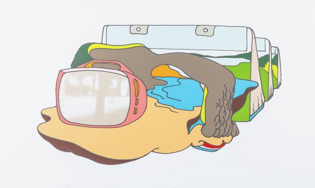
E. J. Howorth | The Prefabrication of Man | Screenprint | 1976
By Lizzie Eickmeyer
Starting from the rightmost corner of
the print, the bookbags carry lush
meadows and endless ravines,
bleeding out past the objects’ normal
proportions. A meaty gray-brown
blob, reading as a ‘fist,’ ‘rocky
cliffside,’ or ‘canyon edge,’ intersects t
he blue background. Flummoxed,
what can we make of this amorphous
space? The leftmost focal point is the
most distinguished in the print - a
bright pink television set contains a
still sepia image of a park. A figure
walks by. In this, the realistic space is
contained by fantasy, but not far
removed from it. “The Prefabrication
of Man” suggests some commentary
on identity, consumerism, or place…it
is a grab into the great unknown of
creation. We, the viewers, are
observers, both within the painting
and in the museum, existing in our
own fabrication. Our built urban
spaces are exclusionary, limited:
Think of neat crisp lawns, pay-to-
play-private spaces, signage telling us
where we can and cannot sit, park, or
drink. As purveyors of space, where
does it - we - end?
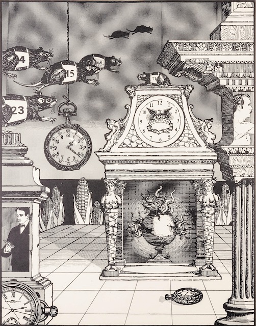
Michael Halldorson | Rat Race | Photo-Lithograph | n.d.
By Brett Stewart
Michael Halldorson’s Rat Race made in 1972 is ripe with urban symbolism. Let’s begin with the rats racing across the sky from left to right, they symbolize the nature of urban settings and their focus on progress and action. The rats are not clearly chasing or after anything in particular other than racing the other rats, like people in cities their own individuality sinks away and all we see are their desperate attempts to catch up or surpass others.
The other major point of note in this piece is the symbolism of the sexes. Men are given two pillars, one on each side of the piece, while women are given the hearth right of center. The left pillar, broken and chipped in places, contains a suited man holding a bottle of alcohol and is only in contact with a racing rat. This pillar is to symbolize the men that get caught up in the rat race of urban environments, focusing on work and profits this pillar implies that all that comes of it is loneliness and non-human solutions to that feeling. The right pillar conversely symbolizes natural man, showing one’s head and upper torso nude to do so, and is unfractured, chipped, or touched by rats. In addition, this pillar holds the piece up going from the bottom to the top, framing the right edge of the piece, symboling the strength of man.
The hearth right of center is used to symbolize women’s place within society and the repression that they experience throughout their lives. Two women hold up the mantel of the hearth with their heads because they lack arms and are bound save their breasts so they can’t move. The removal of their arms and binding of their legs is to symbolize the lack of agency that women have had throughout history in urban environments. While the doubling of their breasts to give them each four is to point out the over-sexualization of the female form in urban environments.
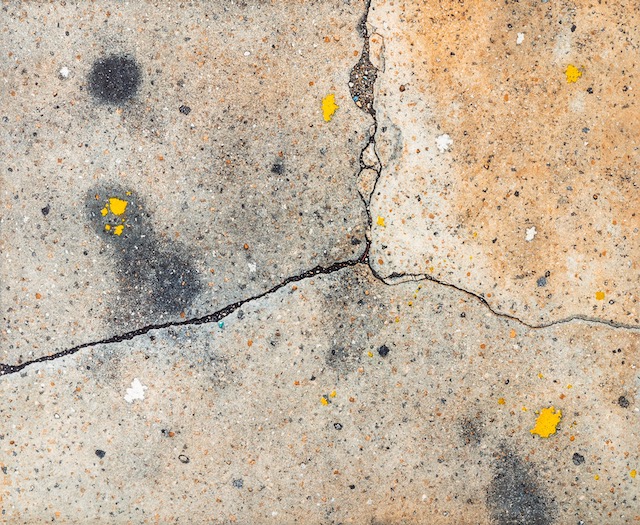
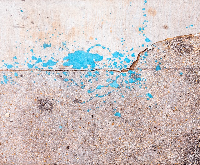
Theodora Varnay-Jones | Landscape VII | Aquatint | 1984
By Amelia Hain
The streets walked by countless people, everyone within their own domain. In a city shared amongst strangers, how do we express our common ground? Landscape IX and Landscape VII work to tell the story of something that unites all city dwellers. It may be hard to imagine the cracks, stains, rubble of the city streets as a venue of unity, a representation of landscape. In a life where many buildings exist exclusively for different genres of city-dwellers, the streets know no rejection. Every person allowed, moving in wavering directions, following the footsteps of all who had walked before.
By the 1980s, San Francisco was gripped with a growing population, and a growing wealth disparity. What and who made the city? Varnay Jones, using digital media, gave perspective on how she viewed her home. Not the skyline, or the bay. Not the hills of Marin, or the Golden Gate. The city was made up of the characteristics beat upon it by a bustling community. The streets, which look the same as any urban center, served as San Francisco’s commonality. The depiction of seemingly mundane focal points emphasizes that city is more than what is deemed interesting by tourists, and new arrivers. The city equated to the paths taken, by the people who make it. Each crack, telling the story of what had come before.
Theodora Varnay-Jones | Landscape IX | Aquatint | 1985
Theodora Varnay-Jones | Landscape X | Aquatint | 1986