
Typography
Whether in campus signs, brochures, or emails, typography either helps unify and clarify our brand message, or make us look amateur and fractured.
Most of the time, one font will do, especially if it’s one with many different weights that work together.
Signature Fonts
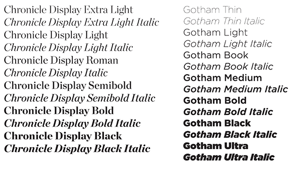
Chronicle and Gotham are the official typefaces of Chico State. They offer the flexibility of choosing either a serif or sans serif font, and each includes a large family of styles and a set of glyphs, making them extremely versatile for use on any project.
If Chronicle and Gotham are unavailable to you, acceptable alternatives are Lora and Work Sans, which are open-source Google Fonts that can be licensed and downloaded for free at fonts.google.com(opens in new window).
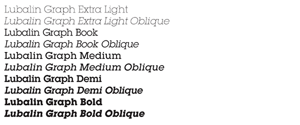
Lubalin Graph is used for Wildcat Athletics projects. This style is sometimes called a "slab serif," and has a strong and open look that conveys practicality and stability.
If Lubalin Graph is unavailable to you, an acceptable alternative is Sanchez, which is an open-source Google Font that can be licensed and downloaded for free at fonts.google.com.
System Fonts
Most of us are working on Windows or Mac computers and creating documents with Microsoft Office. There are a number of fonts that are already installed on your computer, called system fonts.
While they are generally optimized for ease of readability onscreen and in print, some are better than others. If you are limited to using system fonts, we recommend the following fonts.
Serif
![]()
![]()
Sans Serif
![]()
![]()
Fonts to Avoid
Some fonts may feel fun but should be used sparingly and never in official or professional communications that represent the University. There are many fonts that fall into the questionable category, however, using Comic Sans, Curlz MT, or Papyrus fonts could be damaging to you or the University’s credibility.
Designer's Tip
Which Font to Use?
It’s helpful to consider the intended audience and the format (print, web, etc.) of your communications to determine which fonts will work best. Sans serif fonts generally convey a more casual feel, but are more legible in print and on screen. Serif fonts have a more formal or academic character, and are suited for pieces that require more subtle treatments.